

The landing page utilizes a regal blue-purple to invite all kinds of users to enjoy a new transit app experience.
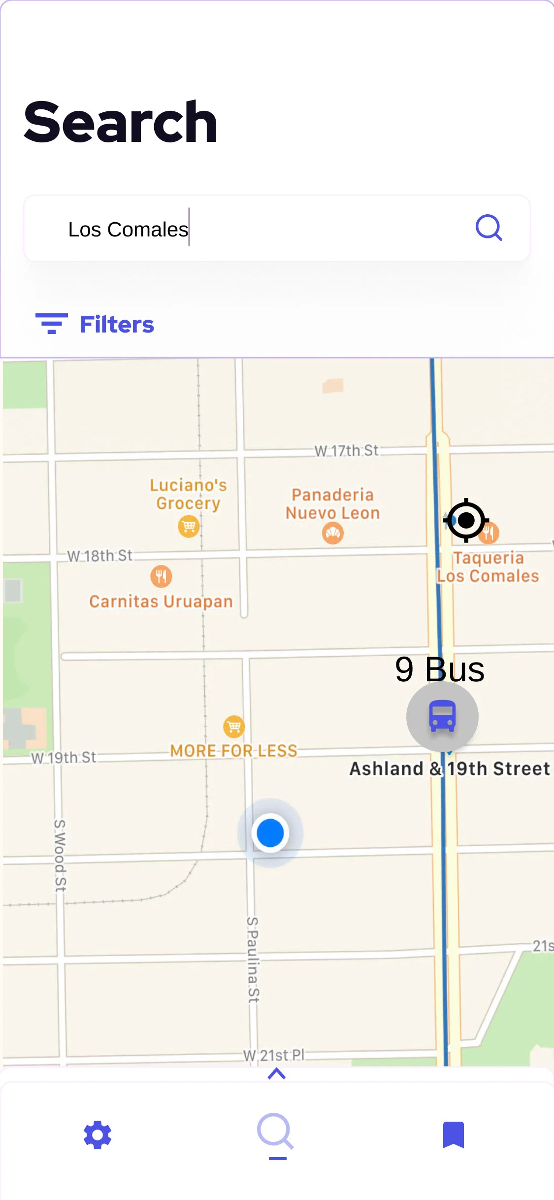
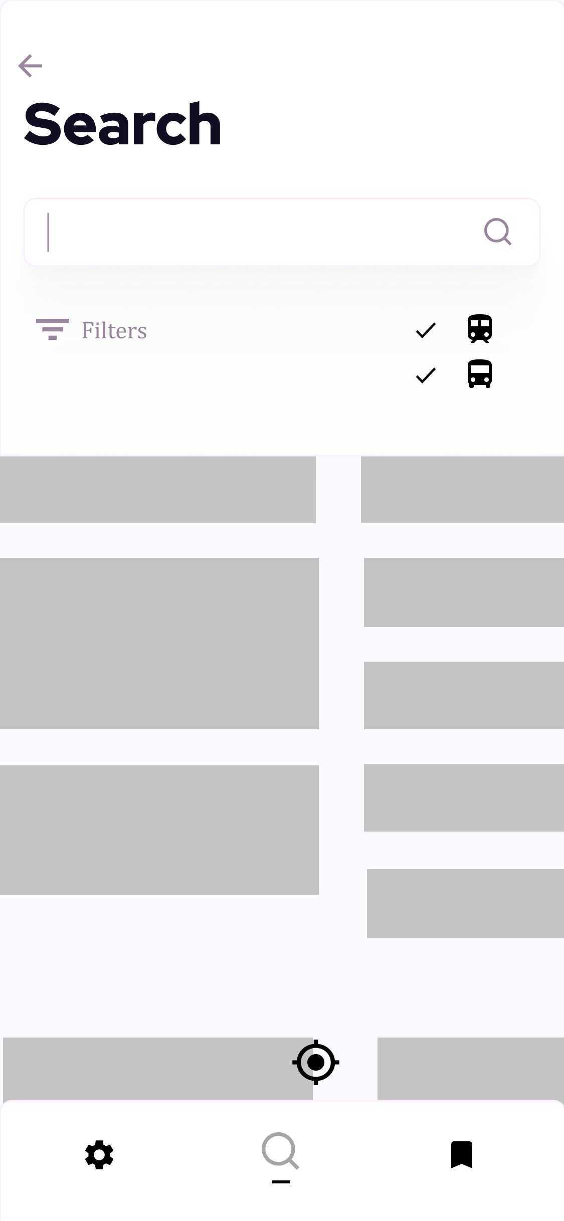
Screenshot of the user searching a hot taco spot using Chi-Route’s search functionality.
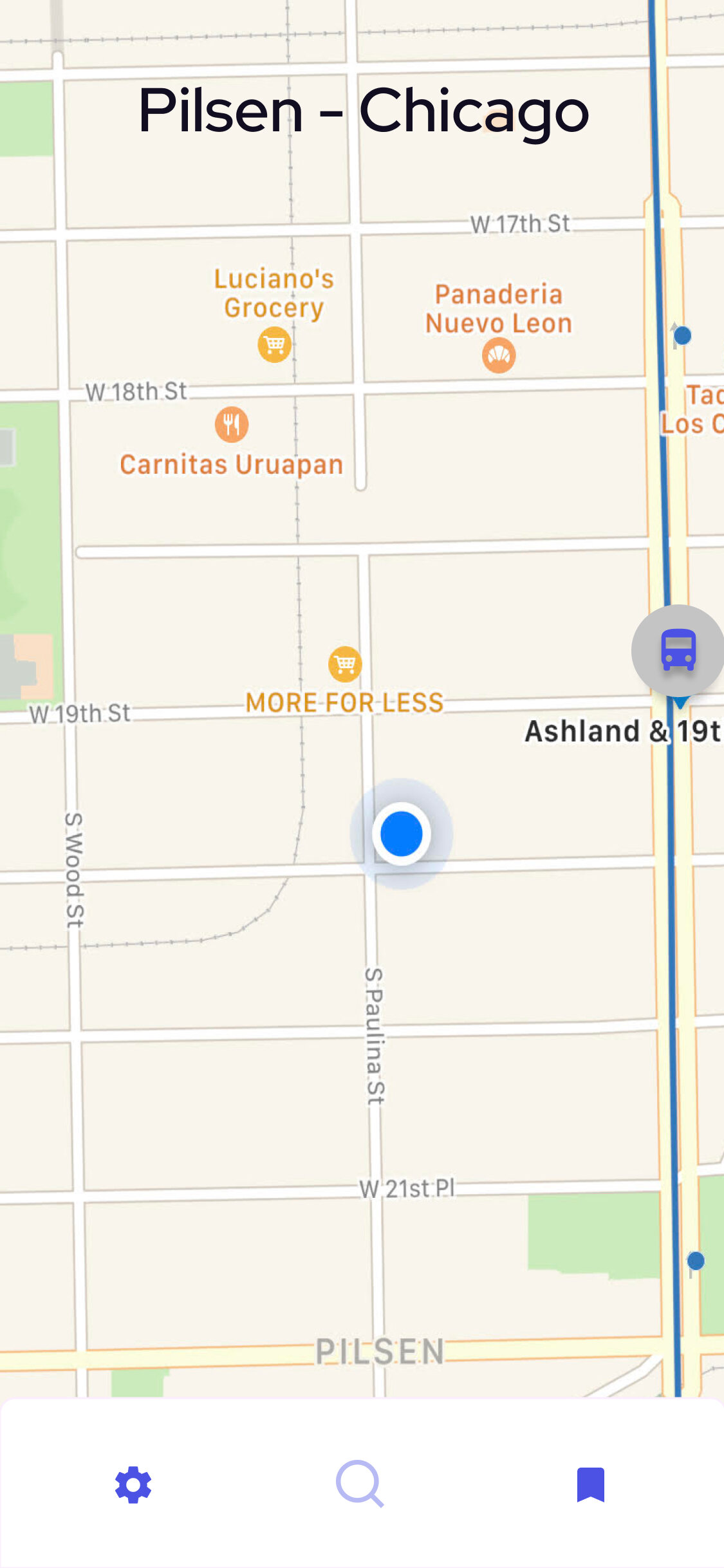
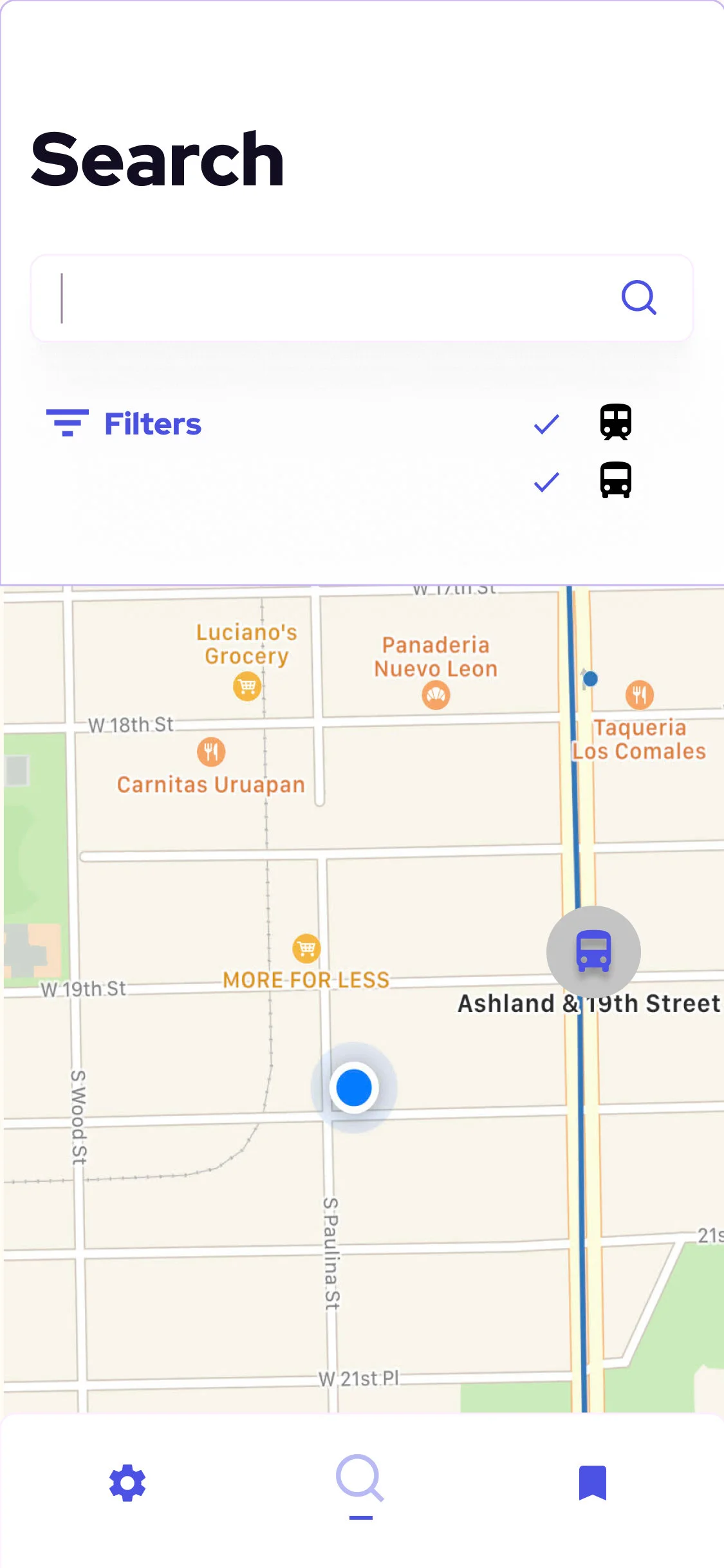
Screenshot of Chi-Route’s geo-location functionality which labels a user’s location by which Chicago neighborhood the user is in.
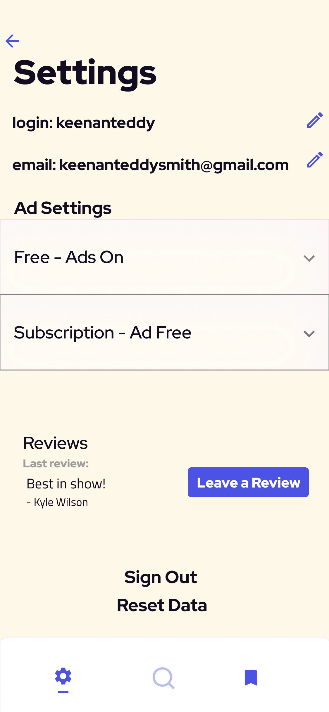
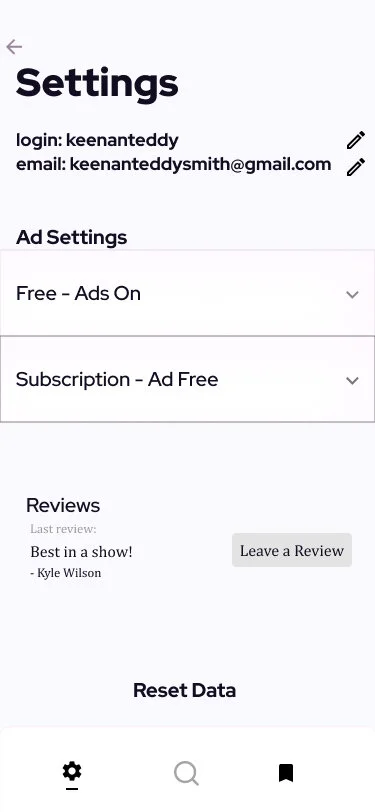
Screenshot of the Settings page.
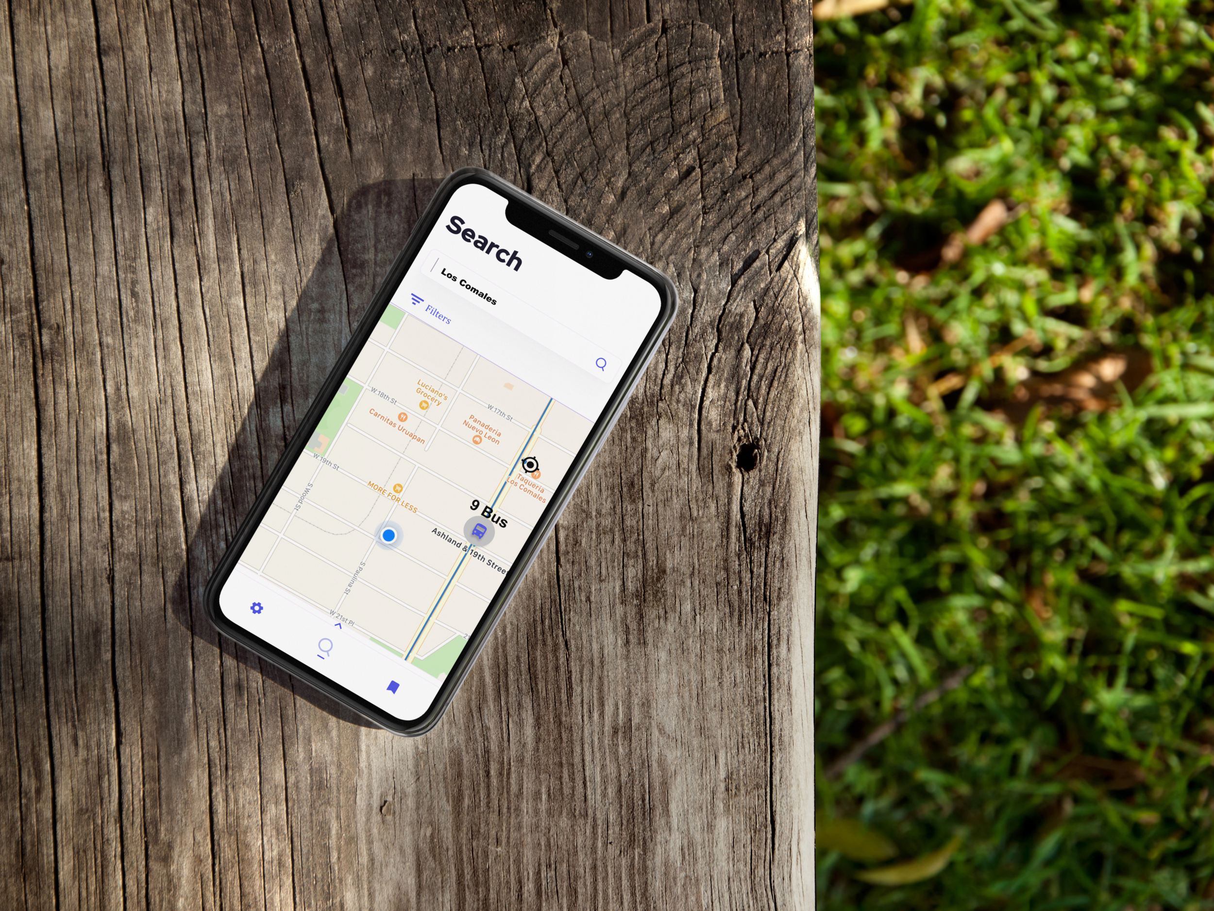
Photo of Chi-Route on an iPhone on a bench.
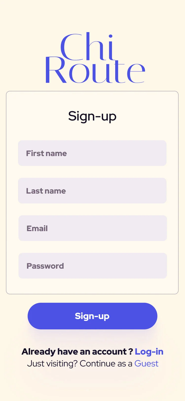
Chi-Route
The Chi-Route app is a public transit application serving urban Chicago, allowing users to save and build specific bus and train lines, measure their time until arrival at specific stops, and build routes by combining lines to accurately plan their commutes through the city. We, a team assembled by Transit-Stop’s Product Manager, collaborated over three-weeks to deliver our solution.
This app builds upon Transit-Stop, the Chicago Transportation Authority (CTA)’s official tracking app, and its use of a saved lines feature. “Chi-Route” building on the hyphen in “Transit-Stop” and seeks to center the application’s specificity to Chicago and its “Routes” feature, separating it from its competitors on the market. The prototype for this application can be found here.
Problem Statement
Our Product Manager found that Chicago:
users reported difficulties understanding which bus would be coming next to any given stop, and;
tracking how many minutes until their specific bus arrived given any delays or system notifications.
Users & Audience
The primary users in question are regulars on public transit, from once a week to multiple times a day.
The Team
Product Manager
Innovation Analyst
Strategy Lead
Product Designer (Me)
My Roles
User Researcher
UX Designer
Visual Designer
Deliverables
Competitive Analysis
User Interviews
Domain Research
User Survey
User Personas
Hi-Fidelity Wireframes & Prototype
Scope & Constraints
Among transportation and mapping applications, this problem was situated within the localized applications tailored to specific cities’ transportation system. This product must include minute-to-minute tracking for all lines in addition to conventional transportation system mapping.
Solution
To design a mobile application which:
not only tracks what bus is coming next to any given stop, but tracks how many minutes until their specific bus has arrived including any delays or system notifications, and;
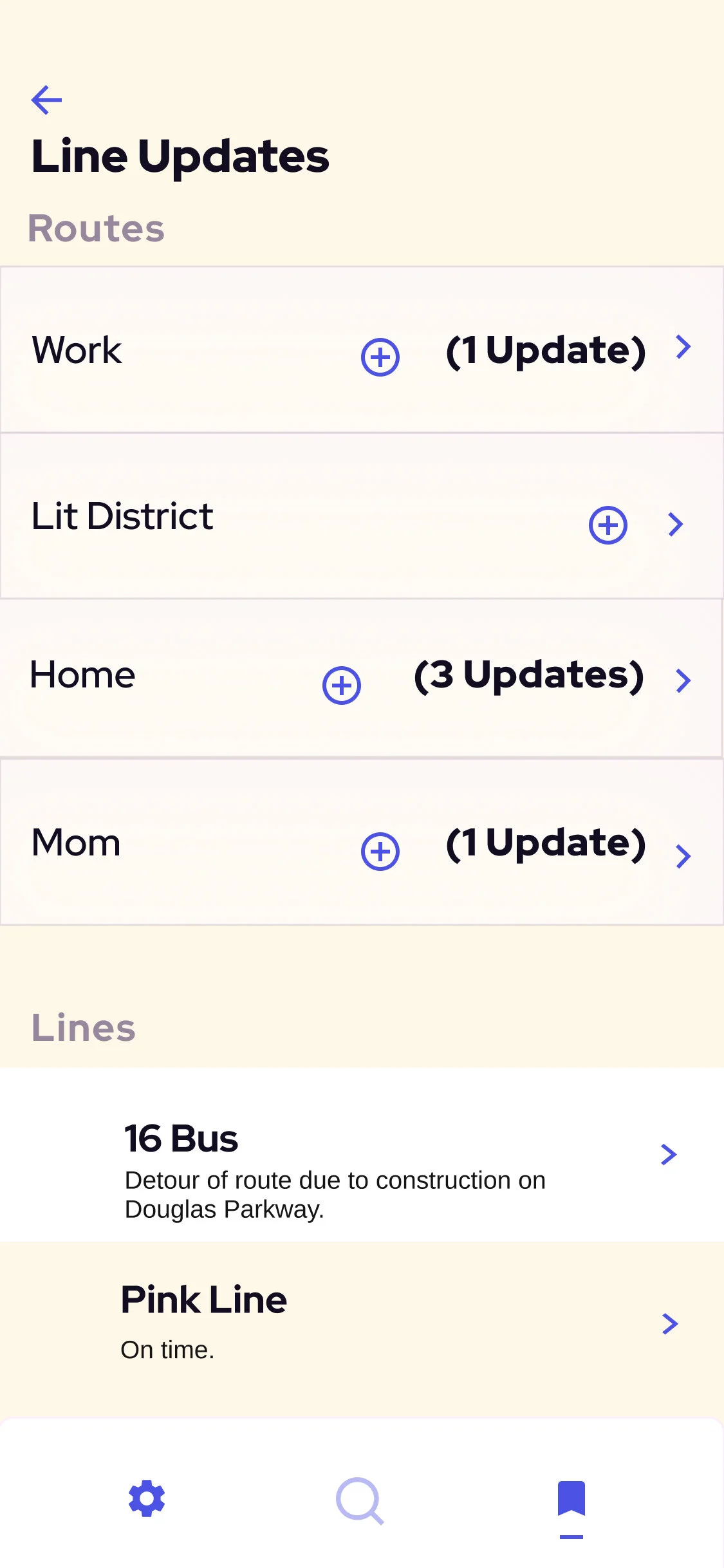
Users reported desiring the ability to combine the saved lines that Transit-Stop allowed, thus Chi-Route connects these through a system of personalized, drop-down “Routes” feature which:
displays minute-by-minute tracking information, and;
maintains the option to solely check saved lines beneath the Routes area.
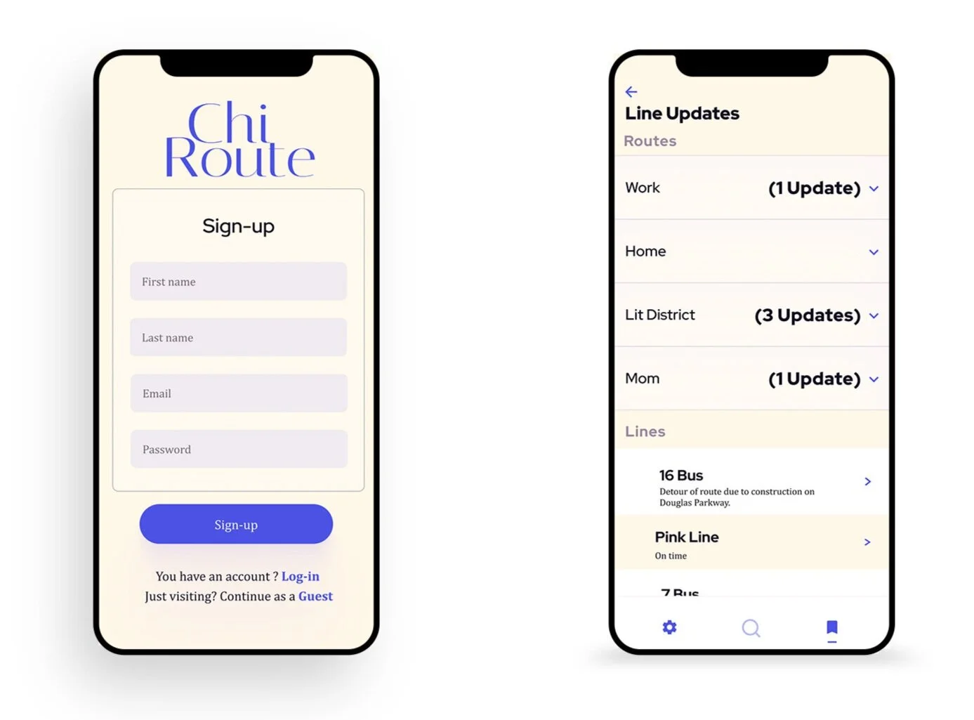
Photo of two iPhones with Chi-Route the landing and saved screens up.
Process
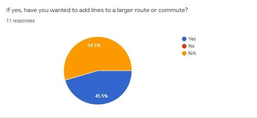
We conducted a survey of users of transportation apps in order to ascertain two pieces of information: users’ reasons for using their transit apps of preference and how they prefer to use these applications.
Of the 11 respondents, their ages ranged from 21 to 46 and comprised users who reported both car ownership and variety of dependence upon public transportation in Chicago.
The majority of these Chicago-based users selected tracking times over finding directions, meaning Chicago transit users already know what lines they need but are seeking up to the minute information.
Respondents reported a preference for Google Maps, which explains why most had not engaged with a saved line feature when asked about it. The next most popular app was Transit-Stop, the regionalized app specific to Chicago, which does offer a saved lines feature. Those who had used a saved line feature were all interested in the ability to compile and organize them.
This indicated that updates and tracking were the primary reasons people used their transit apps and that, when given the option, would save these lines crucial to them.
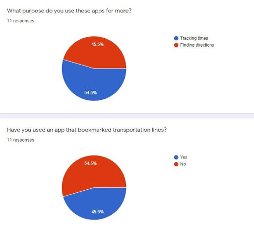
Pie chart of survey responses regarding respondents’ purposes for using bus tracking apps.
Pie chart of survey responses regarding respondents’ experience saving lines.
Competitive Analysis
We compared Google Maps, Transit App, Transit-Stop, and Waze. Among these apps, we noticed a distinct difference in the purviews of transit or mapping apps. Google Maps and Waze are nationally advertised applications that share mapping information via Google (Google acquired Waze in 2013 and have cross-pollinated features from both apps into one another), servicing every city in the nation, if not the world.
Transit App and Transit-Stop are advertised in specific cities for specific information. Transit App supports the transit system in 175 cities across the globe, Transit-Stop focuses on Chicago, but both aim to provide up-to-date tracking information on buses and trains that Google is often wrong about since it is the second-party reporter.
Transit-Stop is the official product of the CTA, Transit App aggregates posted delay information for localities it supports and synthesizes crowd-sourced information for unreported time-tracking information with the reported tracking.
Thus you have the universal mapping apps and the local transit apps, despite the former being the most popular and the problem set requesting information found in the latter. We determined it was best to tailor Chi-Route to the makings of a local transit app to best address the problem set while integrating visual and structural elements that produce the feelings people associate with Google Maps.
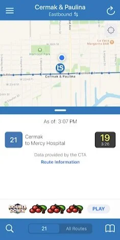
Screenshot of Transit-Stop minute-to-minute tracking.
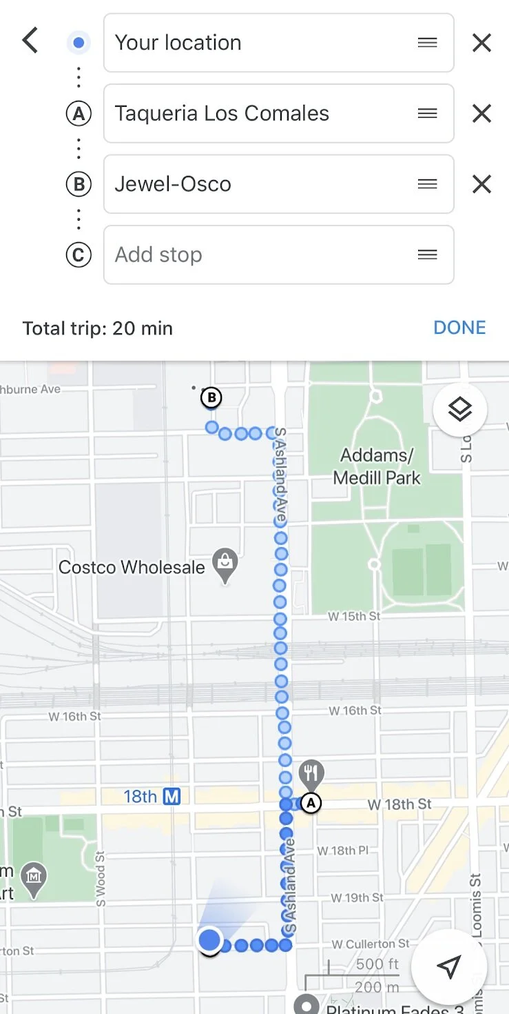
Screenshot of Google Maps’ direction services.
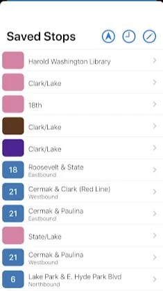
Screenshot of Transit-Stop’s saved stop feature.

Persona of Karen.
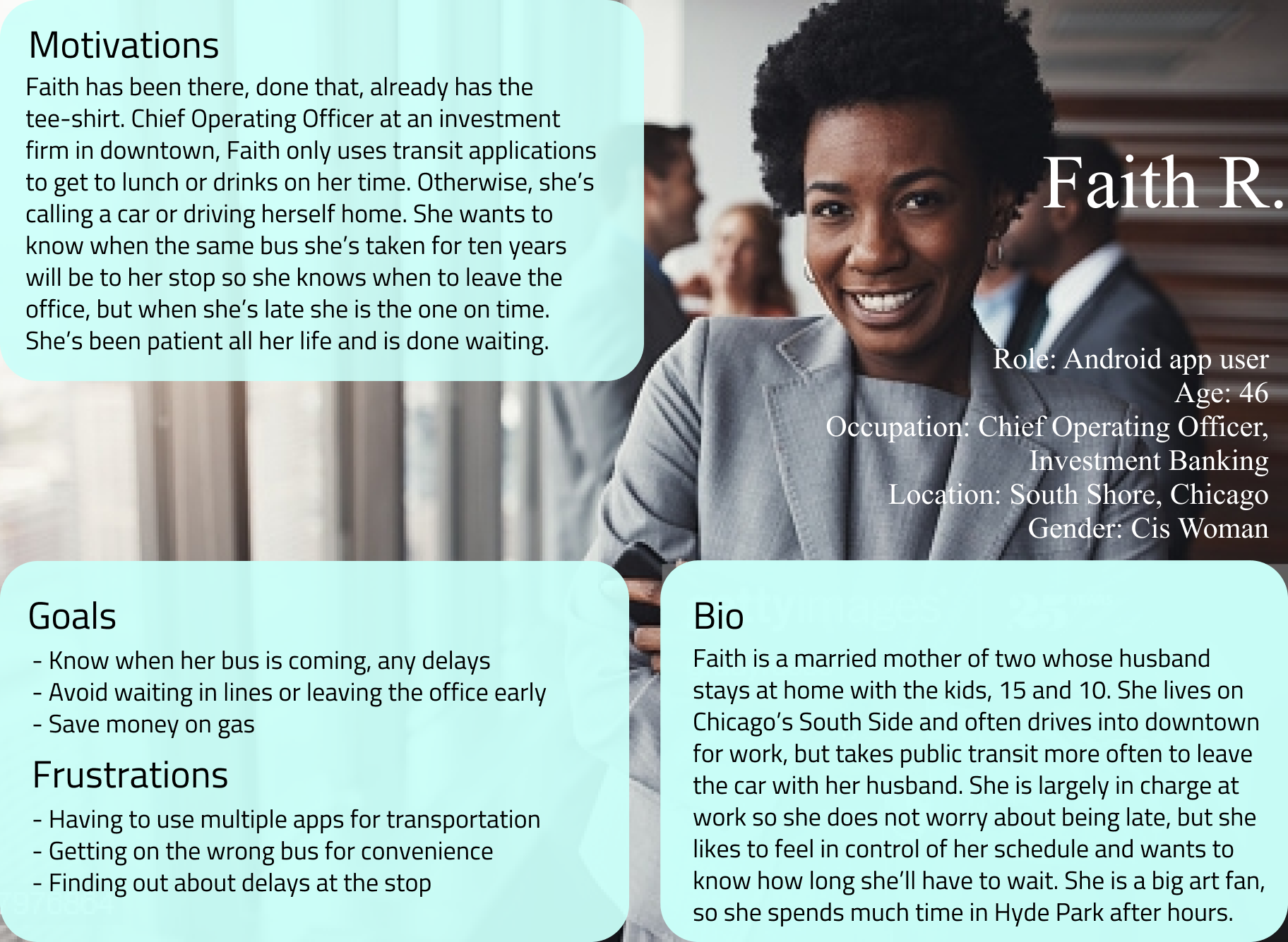
Persona of Faith.
Personas
Karen uses her transportation app to check minute-to-minute tracking, not searching on her daily routine. She only searches for new places she hasn’t been. Karen embodies the survey and interview respondent desire to have the most relevant, pressing information about her saved lines easily accessible as her use is more mundane and quotidian than Faith’s.
Faith uses her applications to search for her day-to-day routine and compares with other lines to see which works best for her schedule, spending more time overall within the app and customizing regularly. Faith is a persona developed to speak to the respondent desire for customizable, adjoined lines as her use is more inquisitive than Karen’s.
Kevin was a law student who traveled between Hyde Park and his internship in the Loop, visiting friends and their family in the suburbs on holidays. Faith and Karen cover those two geographical demographics. Karen has his priorities regarding timeliness for his internships, but also Faith’s nonchalance as he also has a car. I found Faith and Karen represented a wider swath of users and greater extremes, while allowing me to tailor my visual design to color schemes that are divergent from those of the traditional transit app market, which use colors preferred by both genders in color theory.
Wireframe Sketches
I quite liked the interface of Transit-Stop as a base because of its emphasis on the tracking elements, emphasizing the information it holds. However, the Route feature would not allow for the minutes to be instantly visible because they hold many lines within them.
Instead, within the Saved page Routes show how many status updates are recorded total among the lines saved within any given route to show you how many delays you will encounter on your journey. I also sought to parallel the Search page with the search functionality in Google Maps.
The Setting page was modeled after the Transit-Stop Settings page. The Search functionality mirrors that of Google Maps with the trifurcated bottom navigation.
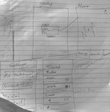
Sketch of the landing, home, settings, and saved pages for Chi-Route.
Load out of the settings pages for Chi-Route.
Digital Wireframing
Wireframes operated from a base grayscale. No logo had yet been developed. We built out the Search landing in Figma myself to get a better sense for how to lay out lines later on in development.
Usability Testing on Wireframing
In order to get a sense for the app’s functionality, I asked my test users to try to update their email address, to search for a taco spot their friend recommended, and try to add that line to their saved lines for the “Lit District,” a neighborhood they go to for parties and socializing.
Users experienced certain dead-ends when trying to save the route after having searched for it. Additionally, there were complaints about the placement of subtext relative to headers, the sizes of the text, and the contrast between the subtext and the background.
It was clear that a better sense of unity within the style guide would be necessary when moving to the prototype. Connecting the dead-ends with other elements of the app would also be important, making sure there would be as much to do as possible within the app so as to demonstrate the versatility of Chi-Route.
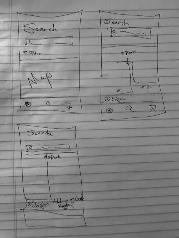
Initial wireframe for Chi-Route’s landing page.
Initial wireframe for Chi-Route’s saved page.
Initial wireframe for Chi-Route’s search page.
Initial wireframe for Chi-Route’s settings page.
Branding
Color palette:
The aesthetic of Chi-Route derives from my choice to design a transit app that turned away from the existing norms of white, red, and blue in the Transit Stop app and the transportation industry at large. I chose a violent-purple because it creates a feeling of both luxury and reliability, something often denied to people who use public transportation. My other color is sand, meant to mimic the pale brown which can be found in both Apple and Google Maps as the color for the spaces where buildings are.
The combination of an unexpected yet pleasing color with a familiar color associated with transportation apps embodies Chi-Route’s intention to innovate upon established technology and become users’ new most reliable source.

Initial wireframe for the search page.
Saved line updates page with the applied sand background and purple action items.
Typography:
Chi-Route appeals to the more style-minded user, someone who appreciates Chicago for its cultural history and present and not just its place as a center of industry. Red Hat Display is the primary font for the subheadings within the app, Arimo is for the informational copy.
Initial wireframe of the saved line updates page.
Saved line updates page with the applied sand background, purple action items, and adjusted copy color.
Logo design and process:
The Chi-Route logo evokes old Chicago, whether it be its art deco past or its gilded age. It evokes moments of great artistic output in Chicago. Chi-Route seeks to appeal to the user who is more interested in their destination in Chicago than the journey.

Chi-Route’s concise logo.
Chi-Route’s developed, extended logo.
Chi-Route’s landing page after applying branding.
Iterations of visual design prior to usability testing:
We implemented a screenshot from Google Maps to get a higher-fidelity image of the Search Page. We needed to create continuity through making each of the action items the same shade of the violet purple.
Preference tests
Users reported enjoying the color choices of the layout. There was a preference for black copy versus a lighter purple color.
“The colors felt like an app I already knew.” - Alaya Carr, Tester
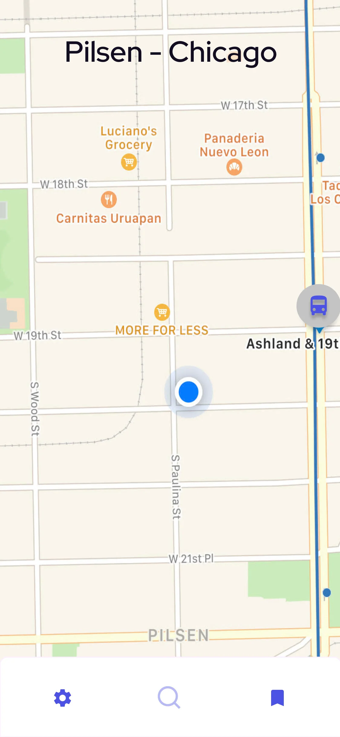
This app is tailored to Chicago and reflects the specificities of the City of Neighborhoods, identifying where users are by neighborhood name in the main map.
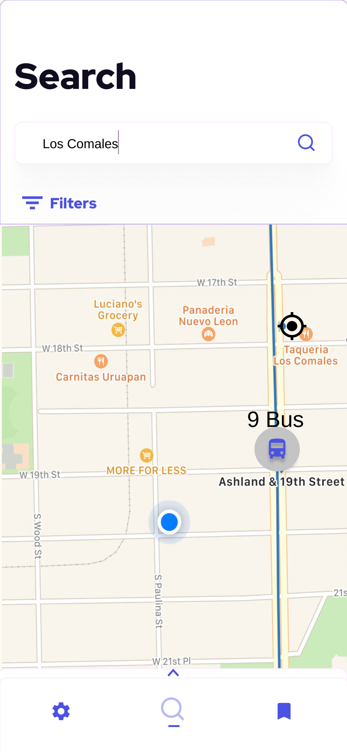
Whether the user is searching for a path to work or a path to a new taco spot, Chi-Route finds the fastest directions possible and allows the user to add this new pathway to an existing Route or to their list of saved lines.
Usability Testing
Tasks tested for:
Users were asked to sign-in and try to change their email address.
Users were asked to save the line to the taco place their neighbor recommended.
Users were asked to check for status updates on their path home.
Overall Experiences:
Found the navigation to be intuitive. There was confusion about which button to press at the log-in page. Users reported no issues reading the text in front of them but on a scale from 1-10, 10 being most difficult and 1 being not difficult at all, the copy text for notifications was the only item ranked above a 1.
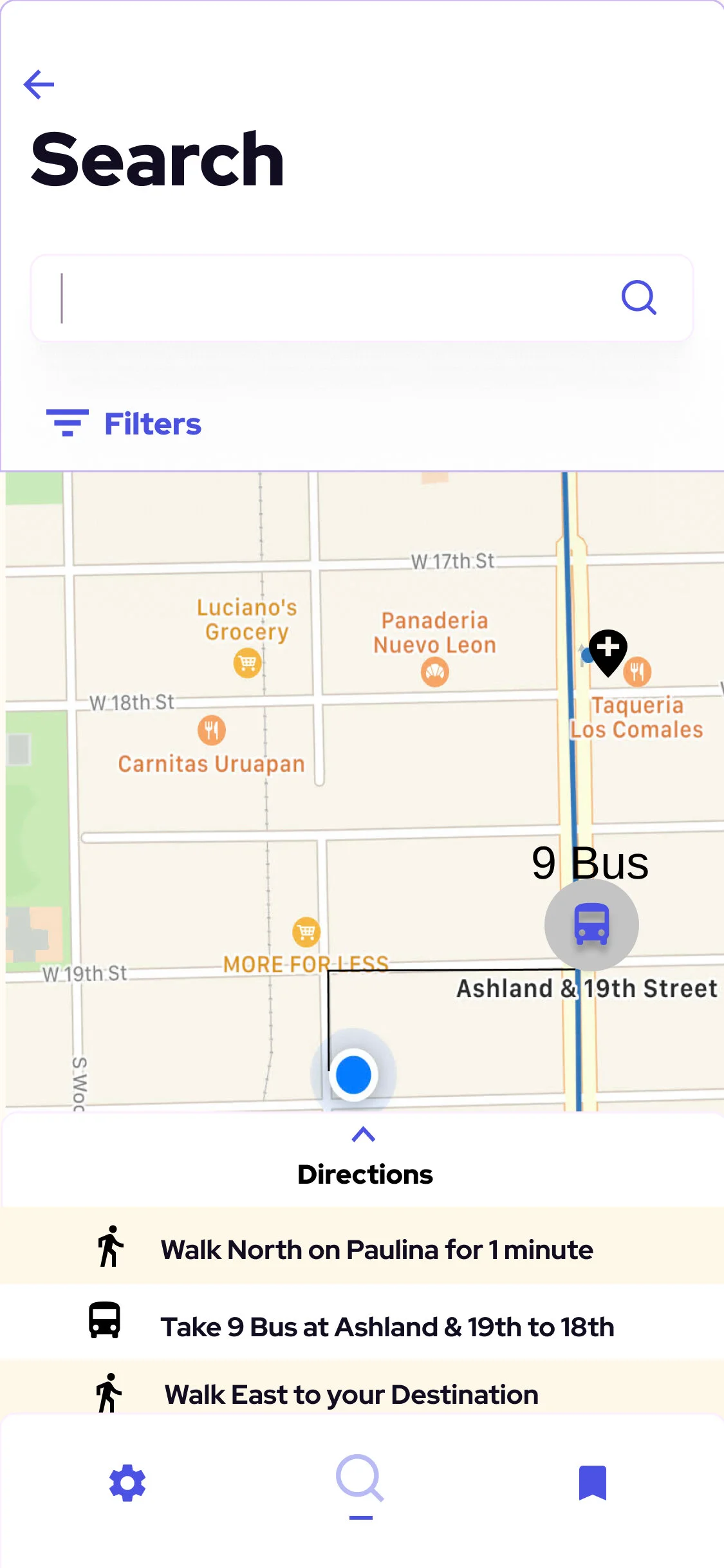
Screenshot of the directions given to the user to make it to their destination.
The user, having found the path to this taco hot spot, is able to save the line necessary itself or part of a Route.
Next steps for improving the app:
After testing, we looped together the loose ends. We increased the copy text size, went with black to increase contrast, and add the logo to the landing page.
Final Thoughts
Going forward, it will be important to expand on the account editing information for the Settings page. Also, visualizing Routes’ combination of saved lines and allowing users to toggle between lines to see different potential combinations and time estimates will improve the tool’s overall efficiency.
Outcomes & Lessons
This project was demonstrative of the role of existing technologies in the development of new tools. It is inefficient and unproductive to always reinvent the wheel, and when it came to visualizing mapping technologies it became paramount to use an existing service since most apps do the same. Additionally, we became aware of the crucial role visual design plays in the unity and legibility of a digital product. Iterating upon my initial designs and encouraging users to share their most minute distress pushed my product to a better place.
In order to help Chicagoans get where they're going faster and more reliably, we wanted to reimagine their experience within the technology. We gave the transit application experience a facelift that emphasizes elegance of the user’s city.
Chi-Route is the answer to the impersonal, clinical transportation application common to today’s metropolitan commuter. Chi-Route is a model for regionalized design to meet the latest innovative technologies.
In addition to getting minute-by-minute tracking, Chi-Route allows for personalized Routes that reflect the user’s day to day commutes. Saving a new line to a new Route prompts a name writing with the vital information about the line in question held in a drop down to be used at the user’s discretion.
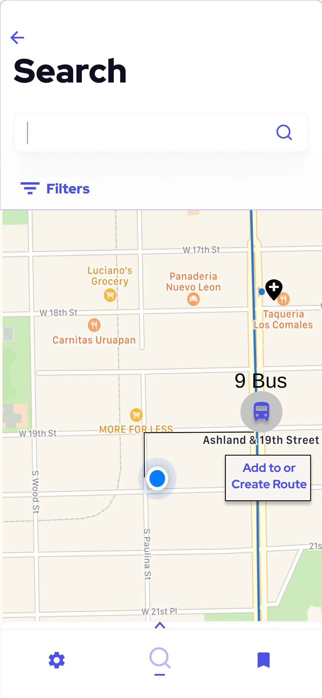
Screenshot of the user’s interface when deciding to save the 9 Bus by itself.
Screenshot of the user’s interface when deciding between which Routes to which they are adding a line.
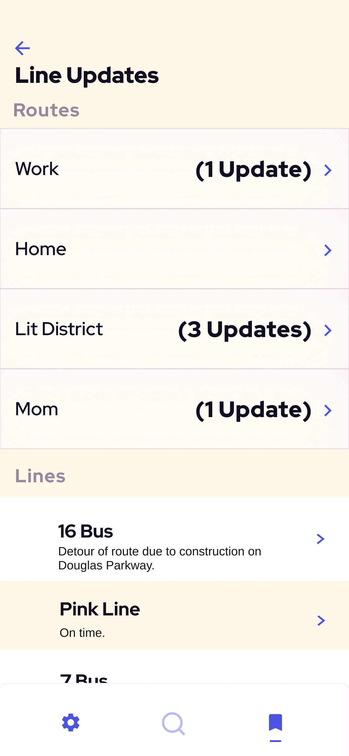
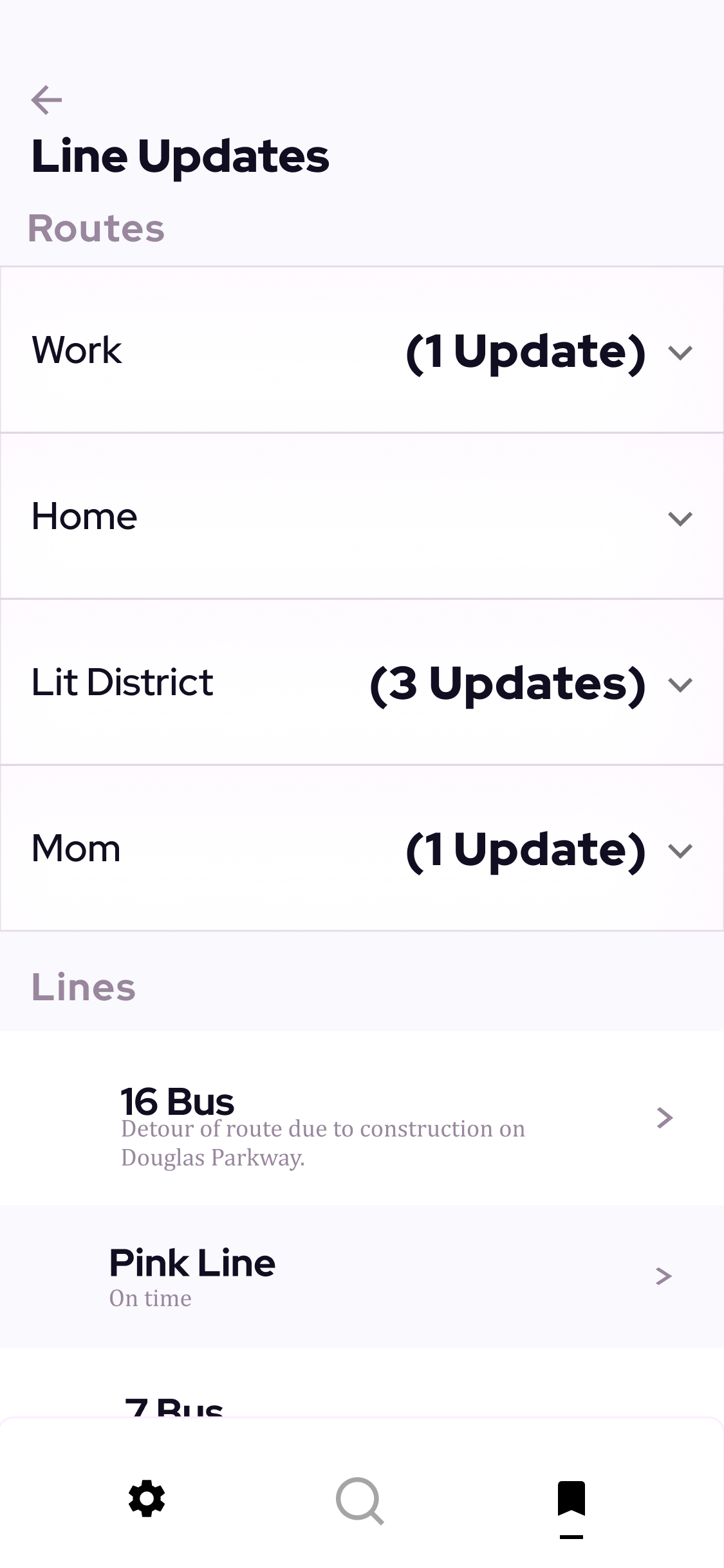
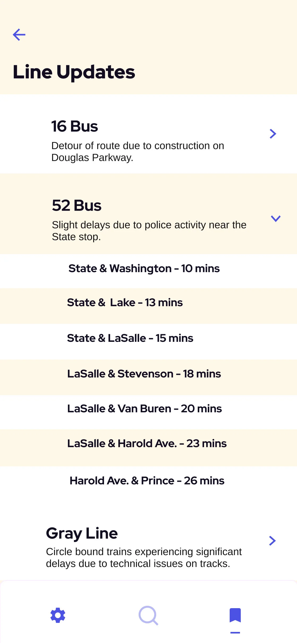
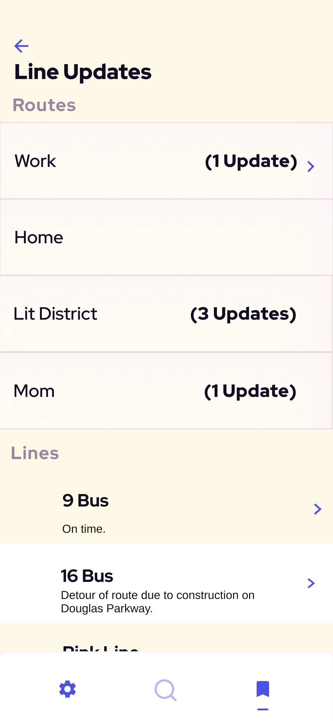
The Saved page allows users to quickly see their combined line Routes, how many status updates combined are on their saved lines for any one Route, and choose to scroll and find a specific line of use.
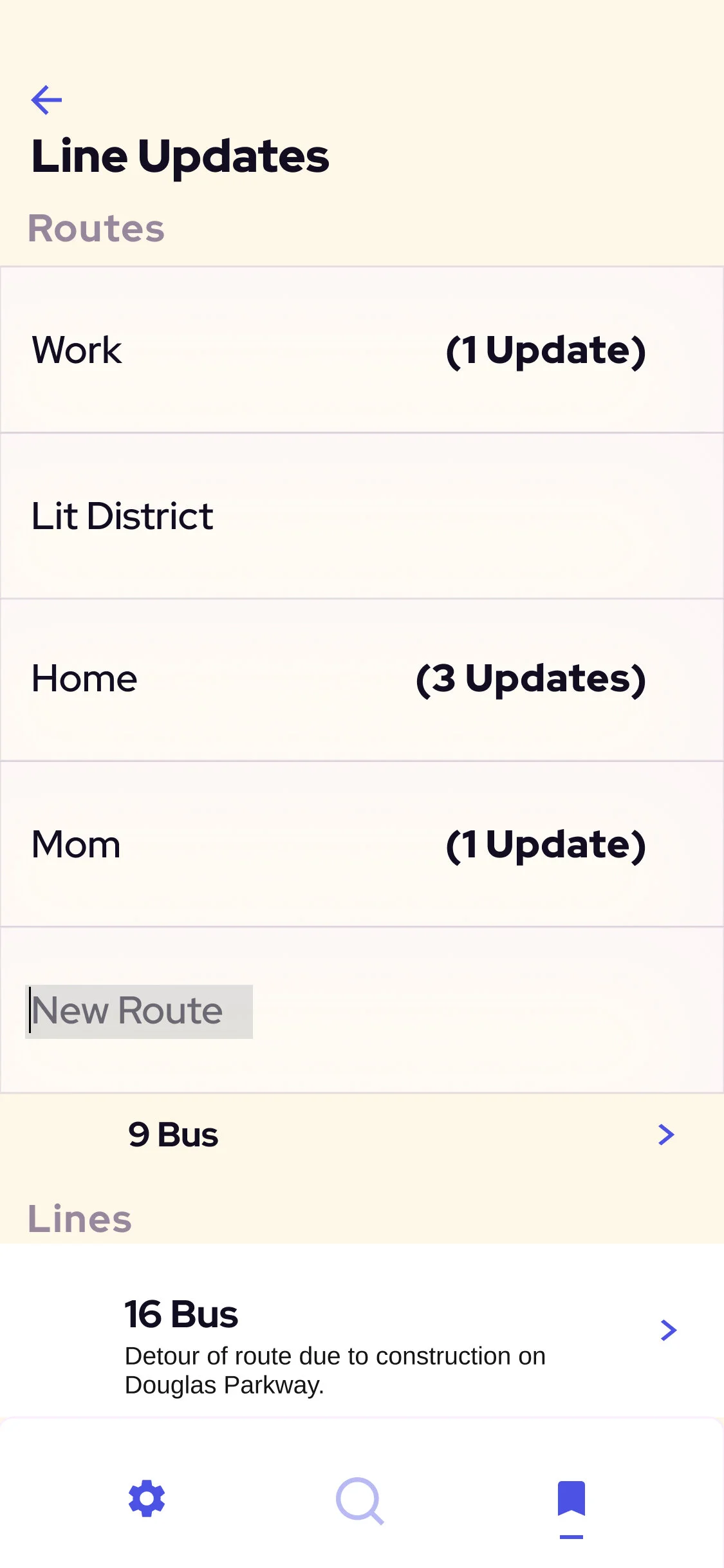
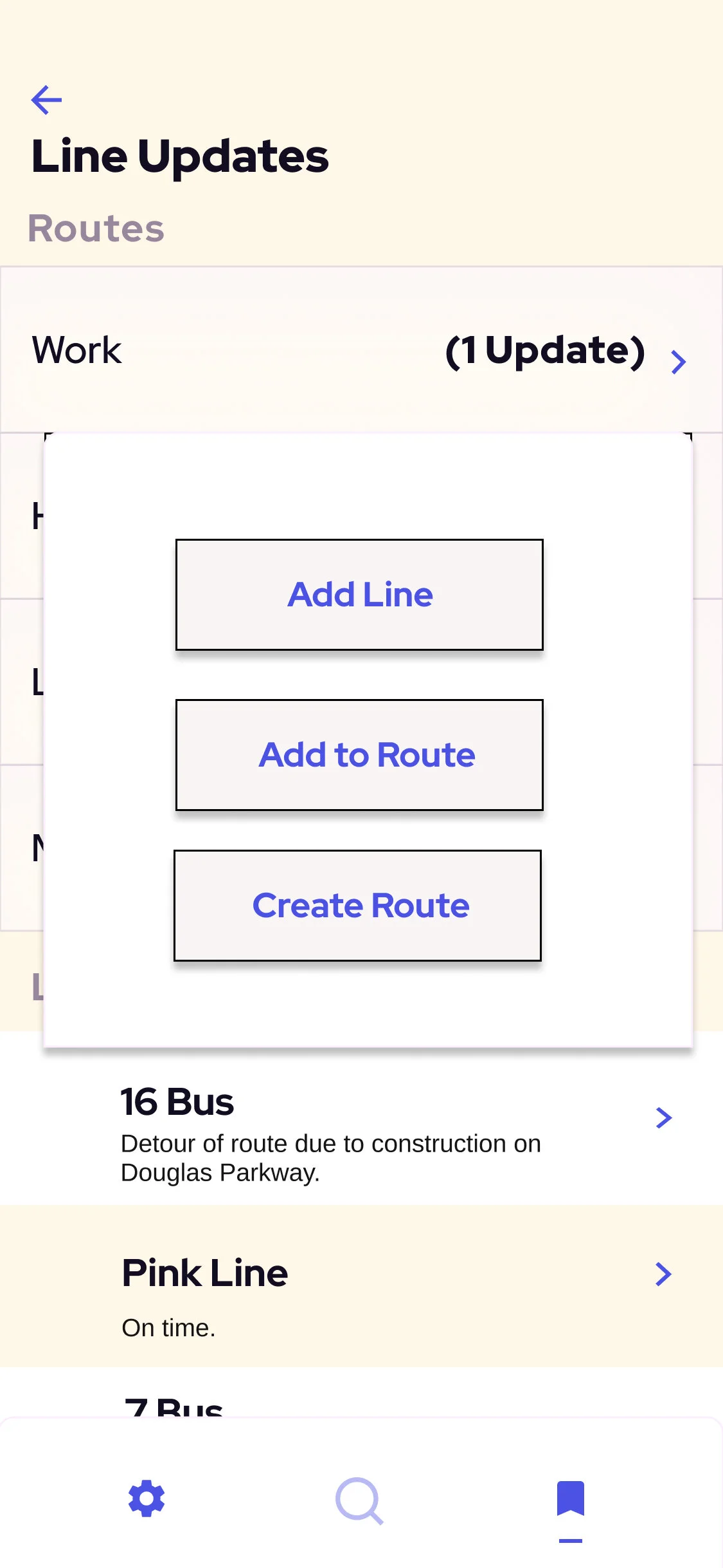
Screenshot of the user’s interface when deciding to add new line to a new Route.
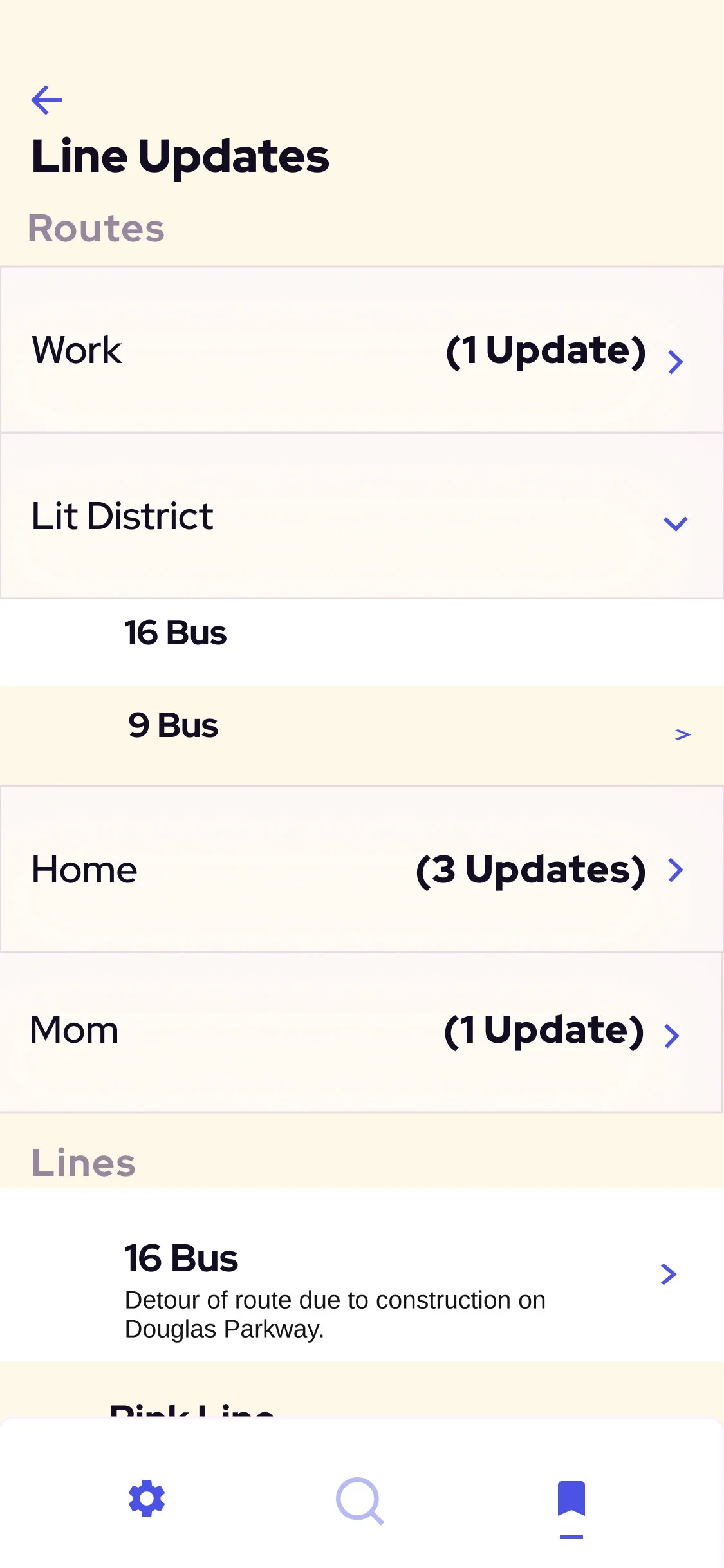
Screenshot of the user’s interface when deciding to add this new line to the “Lit District” Route.