

BAX New Website
Overview
Brooklyn Arts Exchange (BAX) is a Brooklyn, NYC based performing arts non-profit offering space, classes, and community to artists and students of the arts of all age groups. Their website hosts applications for space and grants, photos and videos from performances, event and class registration information, and a donation form. Their final version of my designs can be found here live.
Problem Statement
I was asked to develop a fully functioning prototype of a redesigned website for BAX that:
improves ease of use;
simplifies navigation;
unifies aesthetics, and;
modernizes BAX’s digital visual presence.
Users & Audience
Young adults to middle aged folks involved in teaching or looking for youth education, performing artists, and administrators over events, programs, and grants.
The Team
Product Manager
Innovation Analyst
Marketing Assistant
Product Designer (Me)
My Roles
User Researcher
UX Designer
Visual Designer
Deliverables
Competitive Analysis
User Interviews
Domain Research
Survey
User Personas
User Stories
Annotated Sketches
Consolidated Site-Map
Hi-Fidelity Wireframes & Prototype
Scope & Constraints
The world of art organizations has an ever evolving standard for digital presences, evolving alongside standards of digital design. This product will service patrons, artists, and administrators from not only the United States, but the broad array of backgrounds of the residents of New York City and their families and friends. Additionally, COVID-19 prevented any in-person testing. I was the sole designer for this project.
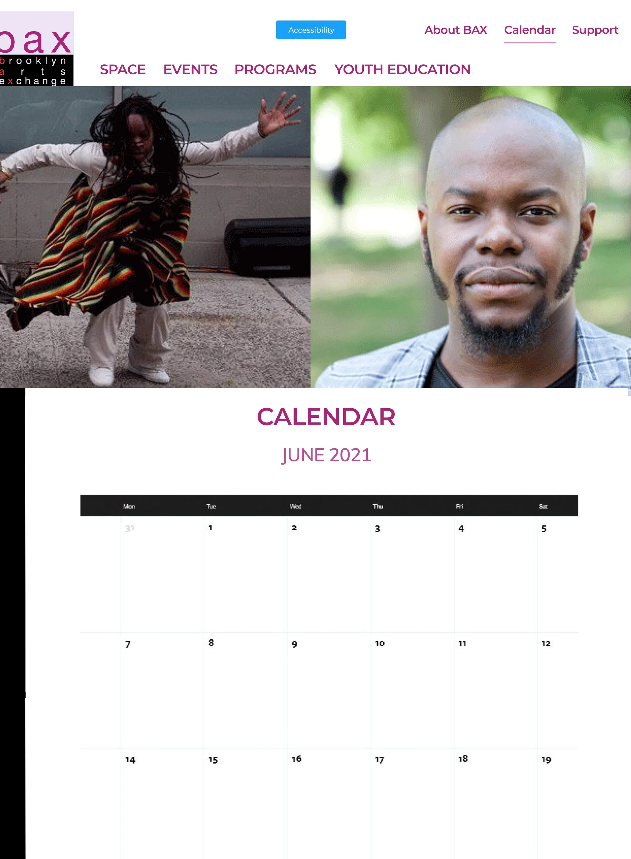
My new calendar feature on the BAX prototype.
Process
I conducted a survey of users of BAX’s website in order to ascertain two pieces of information: users’ purpose for using BAX’s website and experiences using the websites of other arts organizations.
Of the 11 respondents, their ages ranged from 18 to 40+ and comprised BAX educators, admins, marketing staff, and artists outside of BAX.
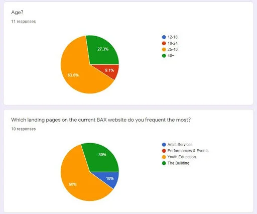
Survey responses from BAX participants, the initial questions.
The majority of these users selected Youth Education as their most used part of the current site, meaning special attention should be paid to user flows that include Youth Education.
The primary concern users had with accessing other arts organization websites was for finding event information, followed by accessing rental information, and then accessing audio and education or artist services. I asked this to give me a sense for what about BAX’s “competitors” here were bringing to the table and garnering traffic.
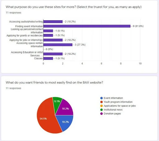
Survey responses from BAX participants, the purpose questions.
I use scare quotes here because “competition” is not the right descriptor of the relationship between these organizations; there is always a surplus of attention and patronage within art institution markets, the goal is attracting people from the already existing base.
The primary pages reported as of importance for users to have easily accessible to their friends were Youth Education, Space, Events, and Donation pages, another valence of importance for what users wanted attention paid to.
Survey responses from BAX participants, the traffic question.
Competitive Analysis
For context, I compared the websites of the Abrons Arts Center Touch Compass, and BRIC Arts. I chose these because, among those suggested, they best exemplified key aspects of David’s desires for the website and the survey respondent’s complaints. Abrons Arts Center, Touch Compass, and BRIC Arts were all cited as exemplary websites that respondents had used aside from BAX.
Abrons became an inspiration for its use of line and negative space, mono-chromatic color-scheming, and carousel as useful for their emphasis of importance through visual hierarchies.
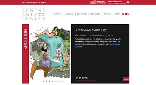
Screenshot of the Abrons Arts Center landing page.
Touch Compass offered a primary hero-image with a locked navigation bar which followed users and featured prominently a User Way accessibility widget.
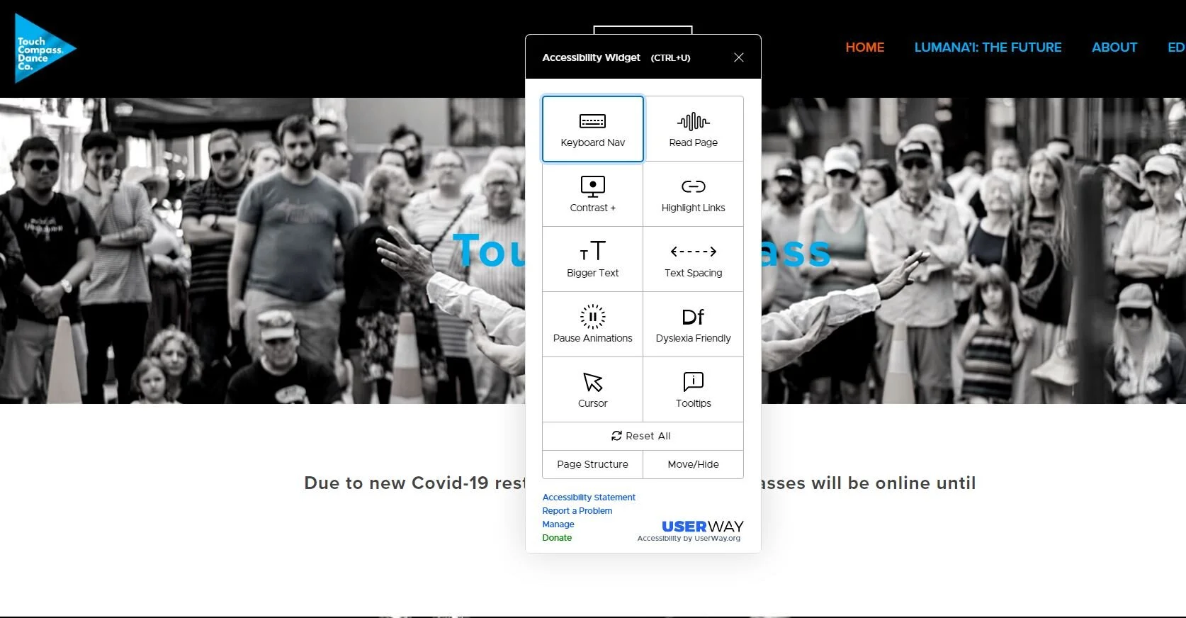
Screenshot of the Touch Compass landing page.
BRIC Arts offered a two-tier navigation bar at the top of the page and a calendar feature not found on any other website listed. BRIC Arts is the largest arts organization listed with the other two much closer to the size and purview of BAX, meaning BRIC has greater funding for these kinds of features and so I wanted to see what the big boys were up to as well.
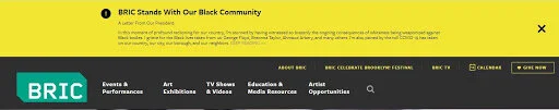
Screenshot of the BRIC Arts navigation bar.
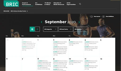
Screenshot of the BRIC Arts Calendar feature.
The primary features I took away from these examples were top-of-page navigation bars, hero-images and image carousel, an accessibility widget, and the usefulness of a calendar feature given the importance of events to all respondents.
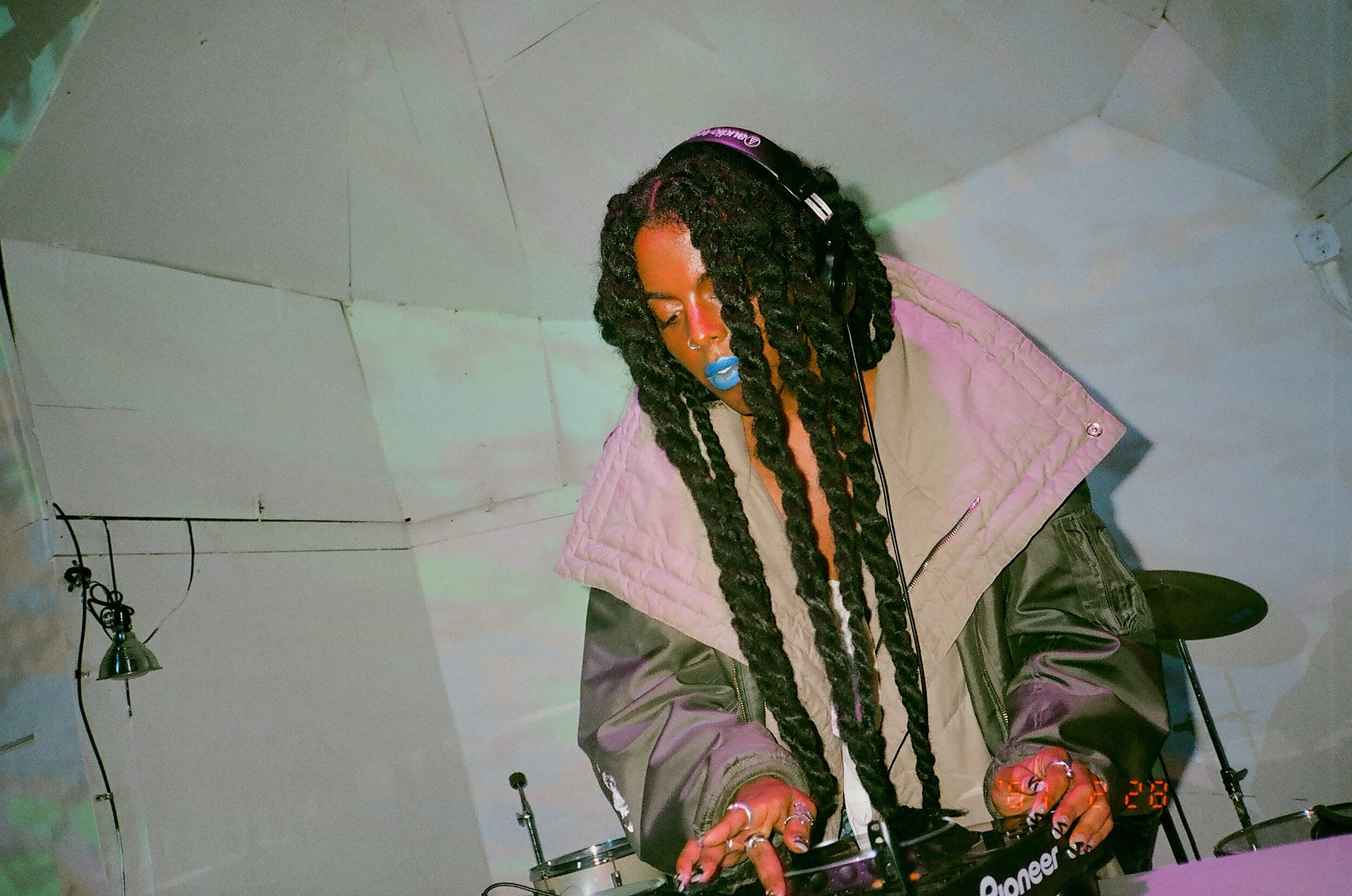
Photo of Juliana Huxtable DJing at Secret Project Robot.
Personas
Juliana (25, Performance Artist in BedStuy) has had friends successfully apply for grants at BAX with fairly positive reviews, and keeps checking sites to find when applications open and close. She wishes BAX had a greater social media presence so she could stay updated more easily. She wants to easily find information about space grants, fellowships, and classes for adults, share event information with friends and family. She can get confused about dates of events on her work calendar and does not have much time to remind friends and family about upcoming events.
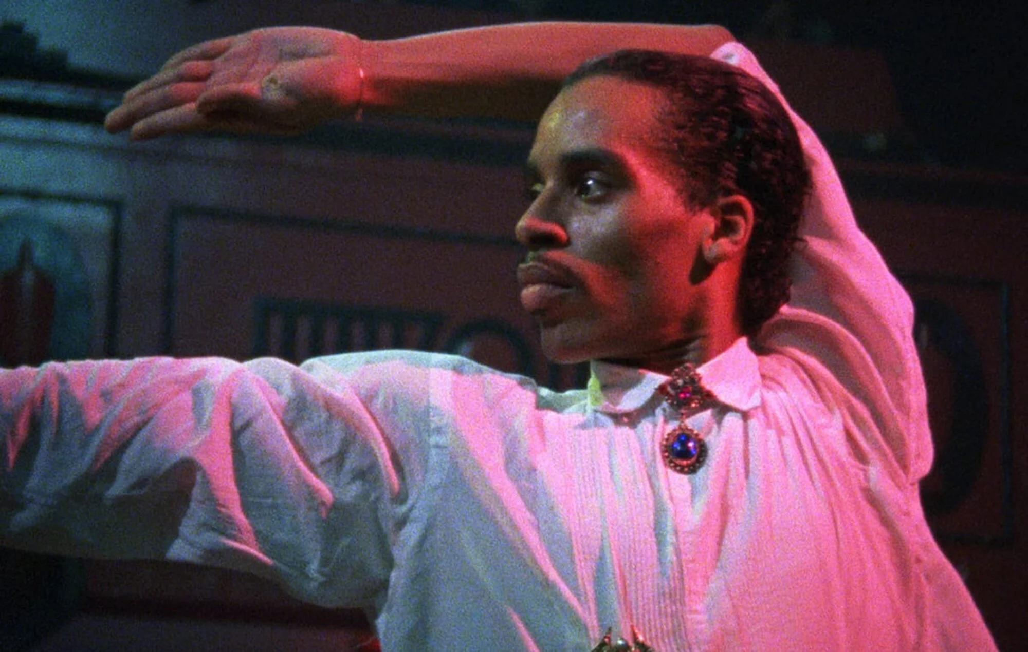
Still from Paris Is Burning (1990) of Willi Ninja.
Willi Ninja (34, Dance Instructor), primarily uses the site to upload, update, and share class descriptions for his K-8 students. He works part-time at BAX so has little time to spend getting from point A to C, needs it simple and straightforward. His primary concern is simplified navigation and stimulating visuals, reads a lot for work so does not want to have to after hours.
User Stories
Juliana Huxtable wants to apply for grants and artist residencies, but relies on social media to keep track of postings. She also needs a simplified navigation in order to easily access that information. Juliana stares at screens all day and her strained eyesight means she needs to be able to adjust settings to how her eyes are doing that day.
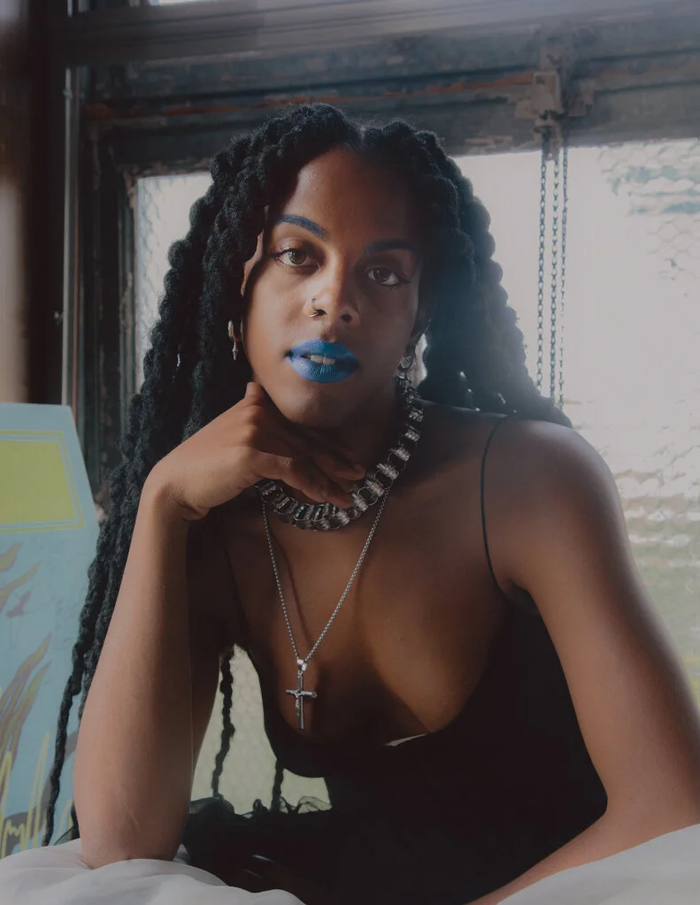
Photo of Juliana Huxtable by the New York Times.
Willi Ninja has so many classes and goings-on, he is looking to quickly access event information and class descriptions. His busy schedule also means he has less time for reading big blocks of text about the class offerings of other teacher’s in order to make sure they are not covering the same material.

Still from Paris Is Burning (1990) of Willi Ninja.
Sketches
Wireframe Sketches
I modeled my sketches on the Abrons Arts Center layout, with a hero image landing framed by monochromatic blocks and lines to guide the user’s attention without overwhelming them. I toyed with the idea of maintaining a carousel given its ability to provide multiple stimuli. Interviewee Sanae’s response saying “I feel like we need more visuals and less text” left me with the impression that using more BAX photos would improve user experience of the page.
My sketch of the landing page possibilities for the BAX design. These feature hero images with the possibilities of multiple carousels.
During the Design Sprint, my Crazy Eights led me to see my primary concern was creating a concise, central navigation accessible to the user at all times. Said navigation space should be buttressed by images and minimal copy.
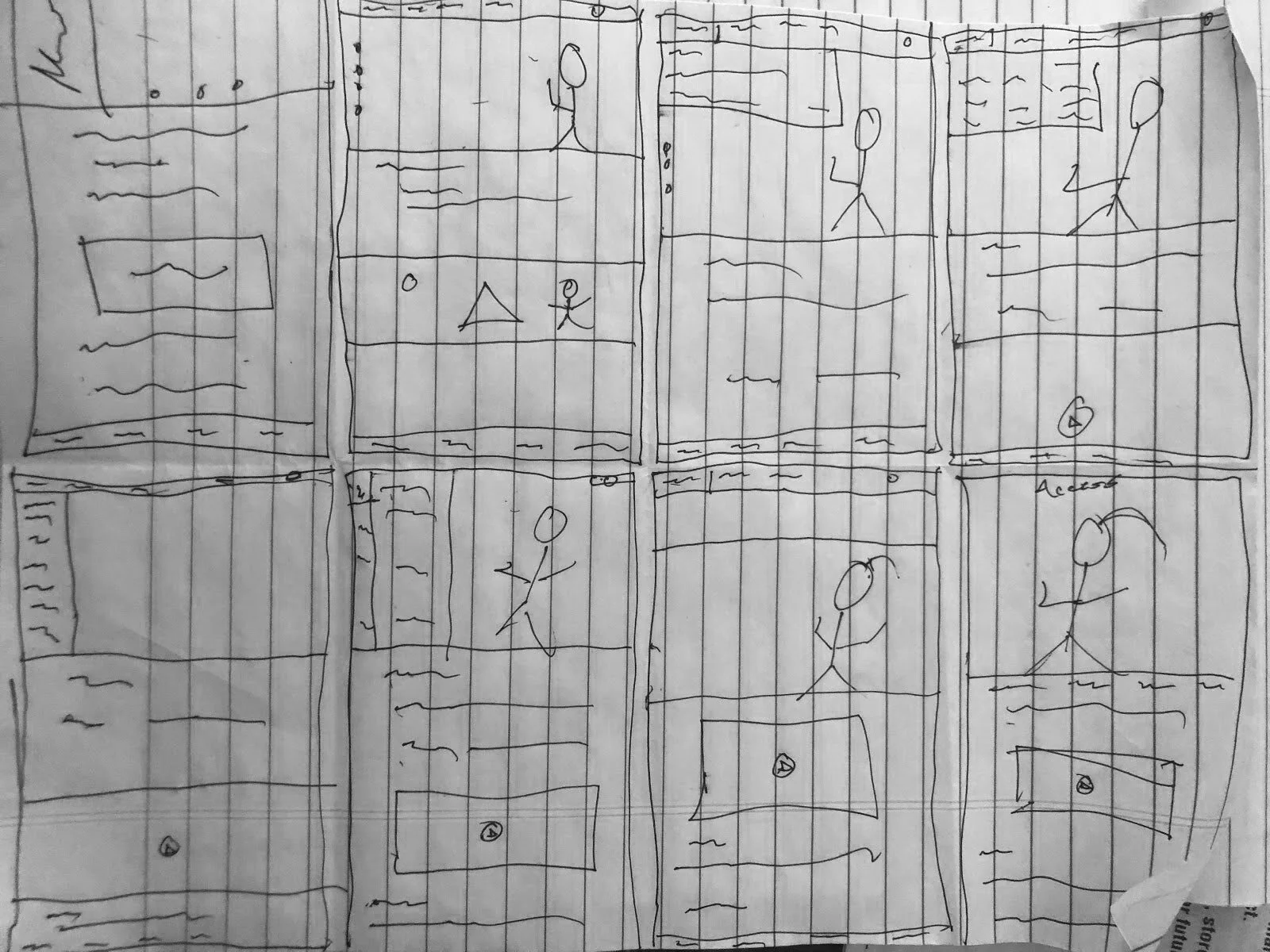
Eight different sketches of possible page layouts. Stick people are representative of images, squiggly lines are text, and lines are page breaks.
I developed a storyboard detailing the steps Juliana would take looking up BAX and adding an event to her calendar, giving me a sense that any destination on BAX’s website should be within roughly three engagements with the product.
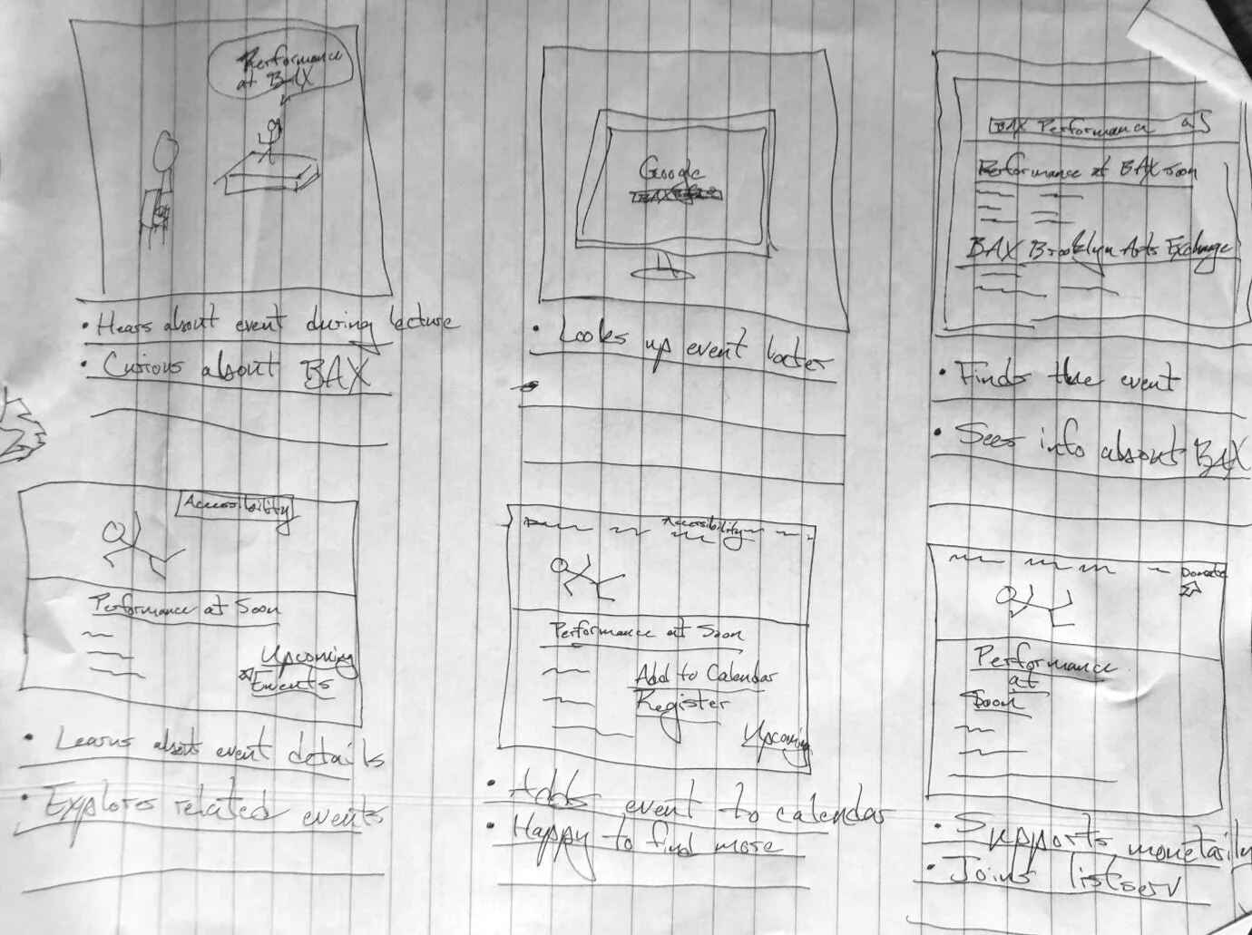
Storyboard of Juliana’s path through the product. Initial image is Juliana herself, the rest are interactions with the product and the product’s layout.
Digital Wireframes
I chose to implement a singular hero image layout for the home page to centralize visual stimulation. Top of the page navigation bar seemed most intuitive given its dominance across the user interface. Subheadings and minimal copy buttressing hero image seem both standard and useful given the depth of BAX’s offerings. I decided to abandon the image wheel for unity’s sake, as no other page would have it.
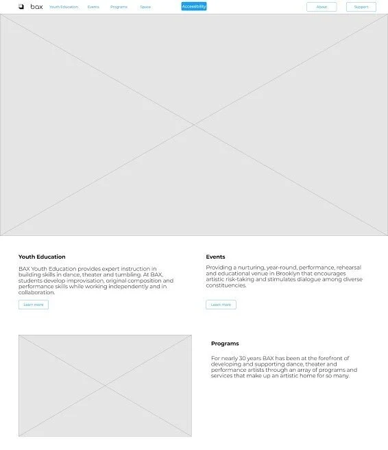
Initial wireframe of the layout for the BAX home page.
Usability Test on Prototypes
Moving to a first low-fidelity prototype, I added the colors found in the sample logo provided by David. I used the simple, three to four color approach to design found in the competitive analysis to create a modern, relaxed feel across the pages. Monochromatic with neutrals for accents, such as this.
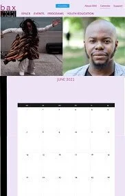
Screenshot of the initial low-fidelity prototype’s calendar feature.
I decided against the sub-header directory because they felt too similar to the original landing pages of BAX’s five domains.
I used visuals for call-to-action items from the pages found on the top navigation bar. Initially, I used black and white to relate to the black and white text found in the logo. The labels for said action items were the same color as “BAX” in the logo to unify the color palette.
I incorporated UserWay’s drop down, should BAX decide to invest in accessibility consulting later. Two-tiered navigation bar with information hierarchy approved by the client.
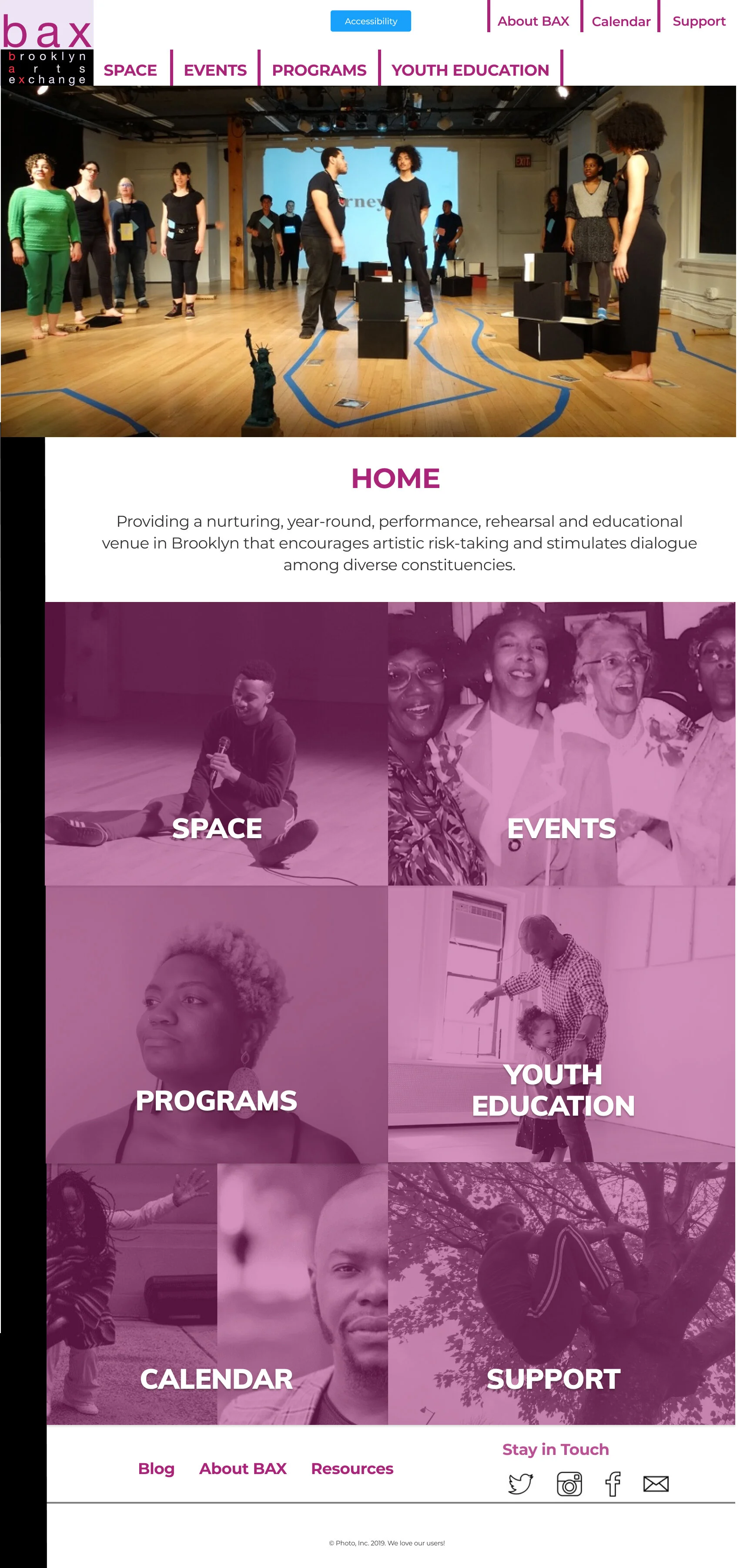
Screenshot of the initial low-fidelity prototype’s homepage.
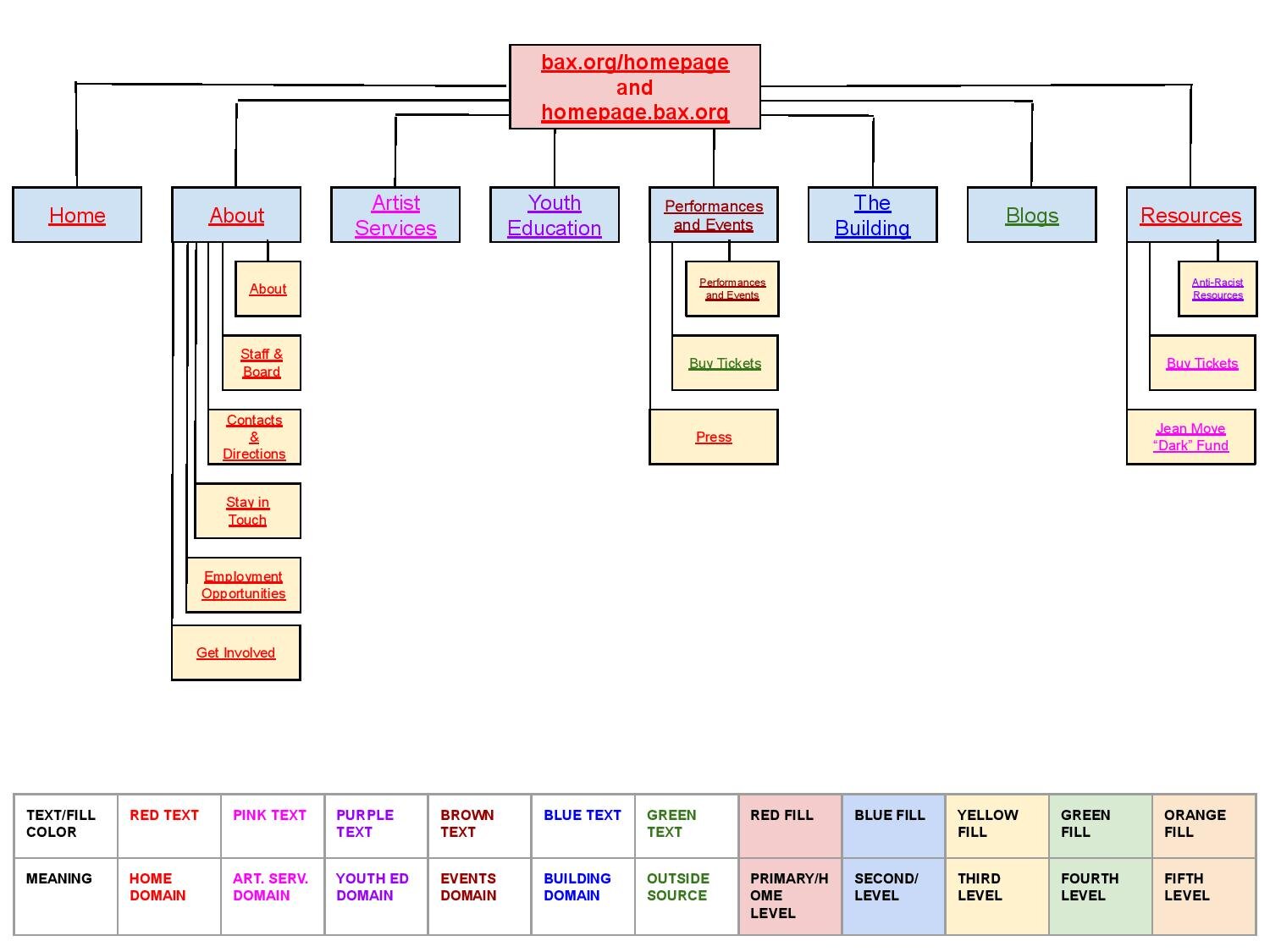
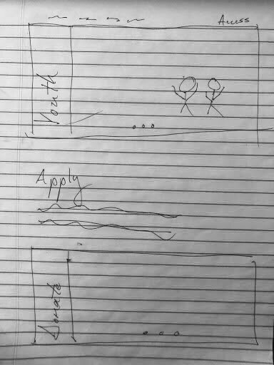
Old sitemap.
The new sitemap.
Branding
My color choices derived from the logo that BAX provided me. I developed a style guide based on this image where action items are the violet of the “bax” text, white a color for text and background mockups, the red stands on its own reiterating the letters of the logo, the lilac of the background of the logo became a background mockup color, and the black was used for the text and the bar which puts the body of the page in relief.
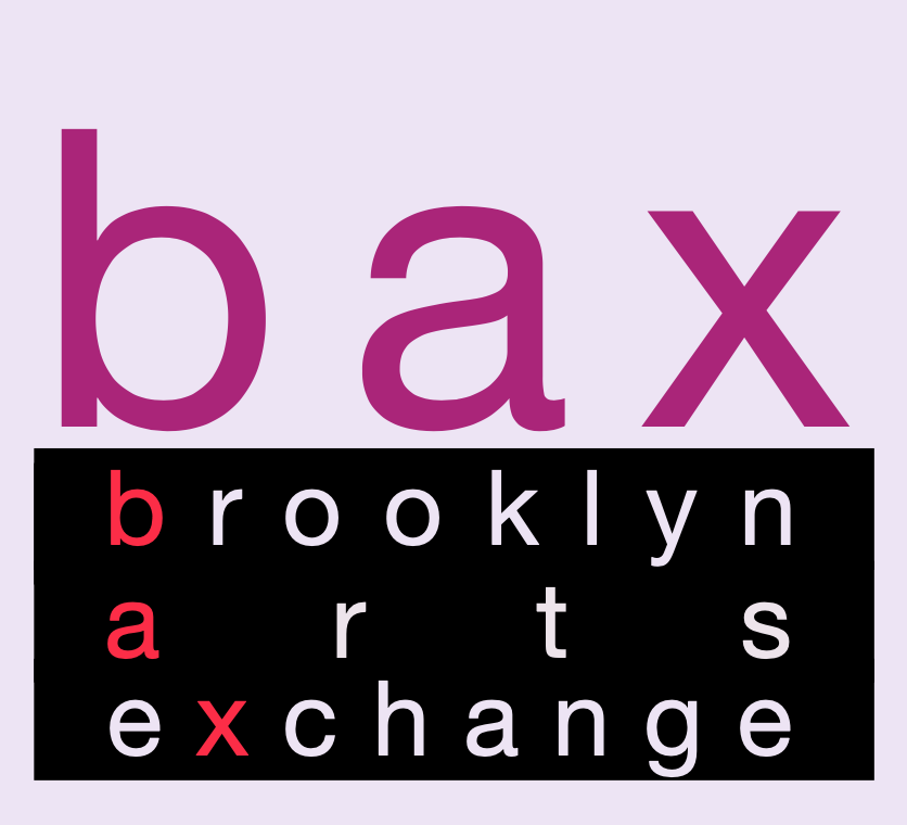
BAX’s new logo as redesigned by the BAX team, the source for my style guide.
This redesign played to the arial framing of the logo so as to further emphasize the minimalist aesthetic of the rest of the new website.
Iterations of Visual Design Prior to Usability Testing
I developed variations of the background and placement of the text to see what alternatives existed to the initial framing.
Preference Tests
I presented multiple prototypes of multiple colors text placements to get a sense for preference. Users reported: a preference for the white background as it highlighted the colors on the page, issues with the text beneath the images as she felt the attention was too widespread, and discontinuity between placements of elements between pages. Overall, users loved this iteration’s attention to visual unity.
Screenshot of one of the mockups of the initial low-fidelity prototype.
Usability Tests
Tasks
Users were asked to find a way to patronize BAX after hearing about them at a talk.
Users were asked to look up an event they saw promoted online.
Users were asked to learn something new about BAX.
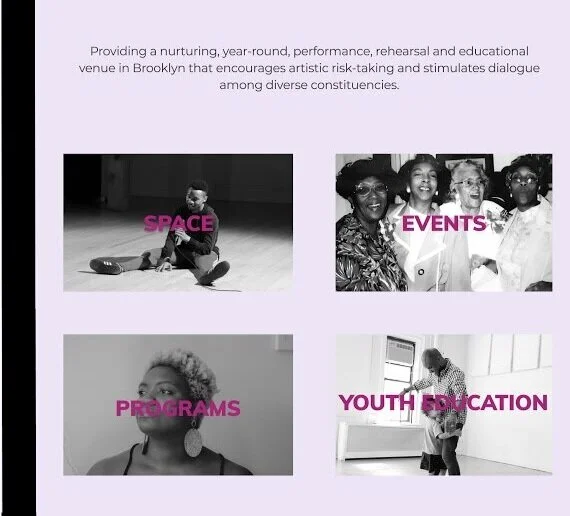
Screenshot of the initial low-fidelity prototype’s action items.
Overall Experiences
Colors on black and white created legibility issues due to a lack of contrast. Hard to tell which page the user is on without a subheading, in spite of the nav bar being pinned. Maybe just one would suffice; baby, not the bathwater…I added socials to the bottom of each page to better improve traffic between these existing digital products. I added the logo to the bottom to emphasize the style guide for the website.
Next Steps for Improving the Website
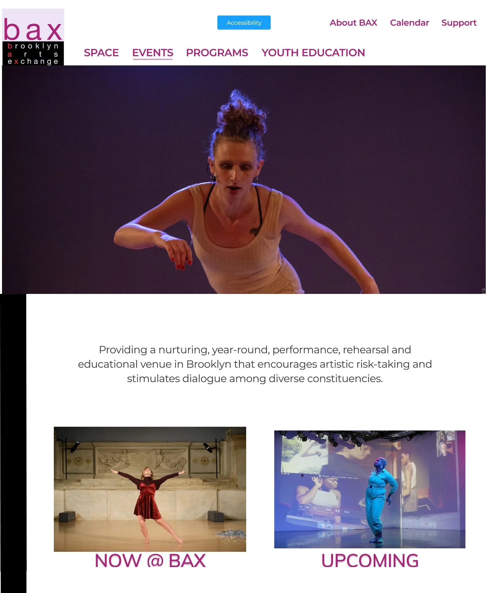
I adopted a page header to reassure the user as to where they are located on the site at all times, beyond the underline. I adapted an overlay of the BAX logo text color for the images that contrasts with a bright white to garner attention and not overwhelm. Decided to stick with the text on top of images because one of the test users said “my attention is too all over the place” in response to the text beneath call-to-action images.
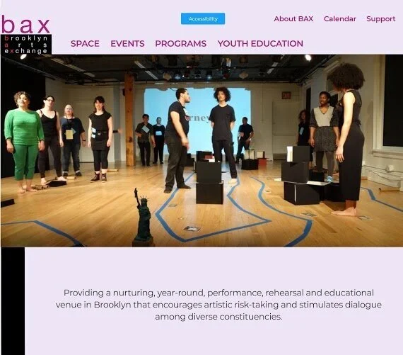
Final, high-fidelity version of BAX’s homepage.