
LocalEyez
Overview
LocalEyez is a concept for an event-finding app that tailors suggestions to a user’s preferences. Using machine learning, LocalEyez curates collections based on stated interests and past events while also hosting a searchable map and editable event calendar.
Problem Statement
I was asked to deliver a mobile product derived from their website that was clean and minimalist, using machine learning to guide the design.
Users & Audience
Young adults to middle aged folks involved in teaching or looking for youth education, performing artists, and administrators over events, programs, and grants.
The Team
Marketing Strategist
Product Lead
Visual Designer (Me)
My Role
Visual Designer
Deliverables
Competitive Analysis
Domain Research
User Personas
User Stories
Annotated Sketches
User Journies
Hi-Fidelity Wireframes & Prototype
Scope & Constraints
Chicago is a city of neighborhoods that has been spiritually hit hard by COVID-19’s impact on people’s ability to gather during the summer. This product is tailored to the experience of Chicagoans, while testing with the experience of users across the country. Additionally, COVID-19 prevented any in-person testing. I was the sole designer for this project.
Screenshot of the elements I gathered to use for the LocalEyez app, categorized.
Process
UI Inventory
Using the materials provided by LocalEyez, I identified the items necessary to construct the interface so as to create consistency across the screens. This involved taking screenshots of what I had and categorizing them according to their usage. This gave me perspective of what needed to be created to develop a new feature, specifically for machine learning capabilities that were not already on the website.
LocalEyez website wireframes that I used for the UI inventory.
Competitive Analysis
For context, I compared the websites of Foursquare and MeetUp. I chose these because they are two of the most popular general events apps on the iOS App Store and have parallels to LocalEyez’s UI. Foursquare uses a calmer blue for their highlight against the neutral background. MeetUp uses a brighter red for action items and attention grabbers, which goes against the color scheme given by LocalEyez. However, the multitude of colors used for the categories of events was deeply inspiring of machine learning elements I wanted to incorporate.
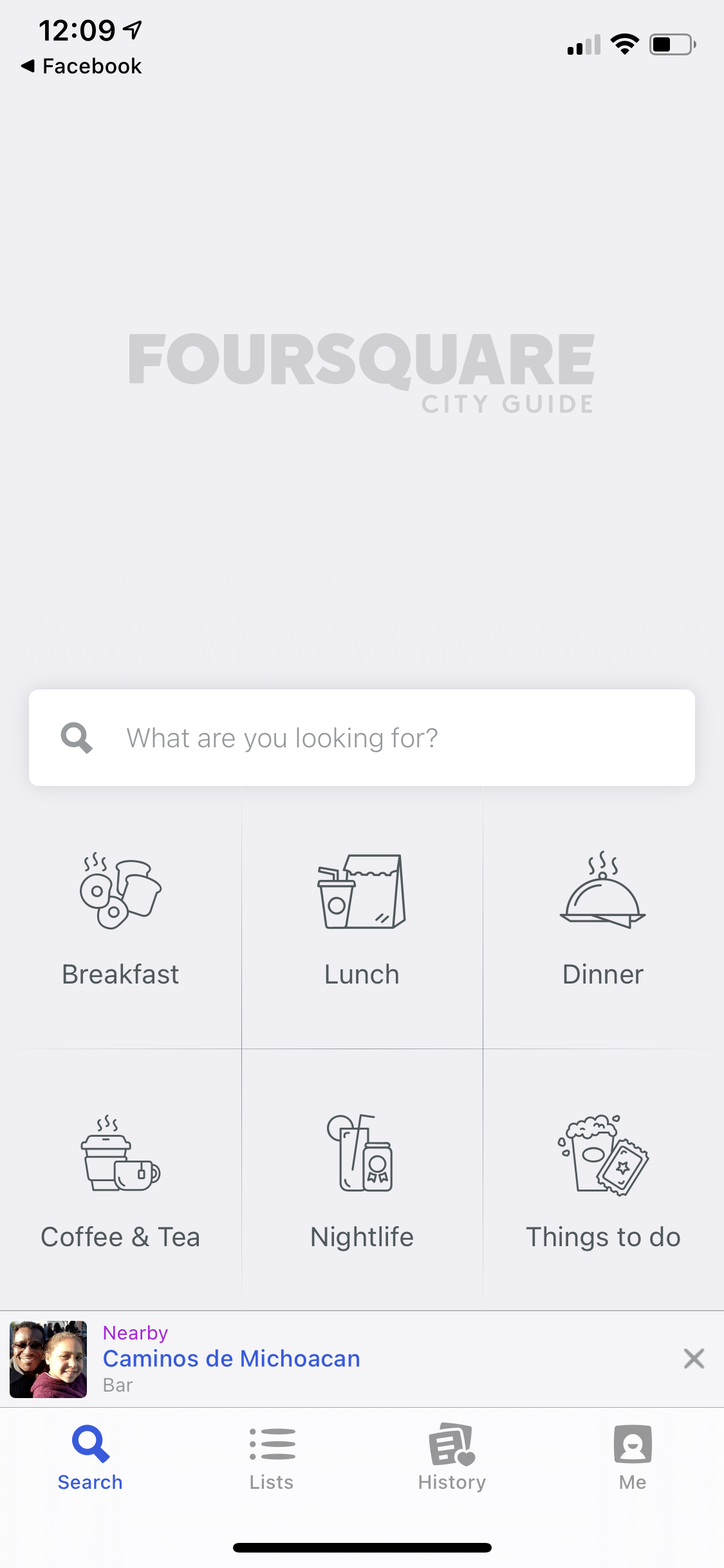
Screenshot of the Foursquare landing page.
Screenshot of the MeetUp app landing.
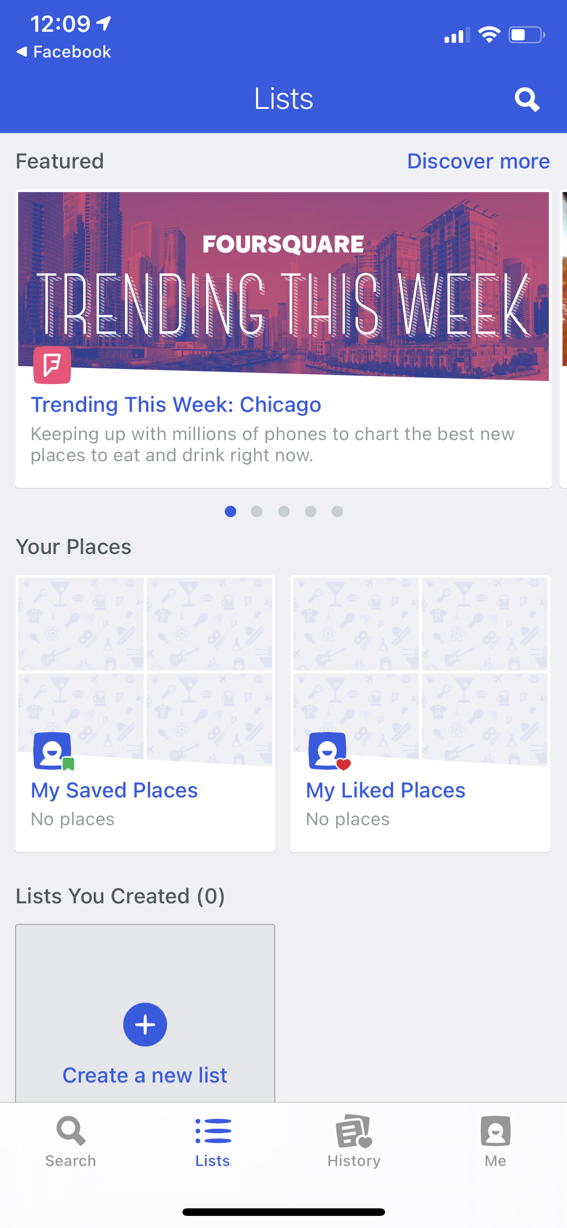
Screenshot of the Foursquare Lists page.
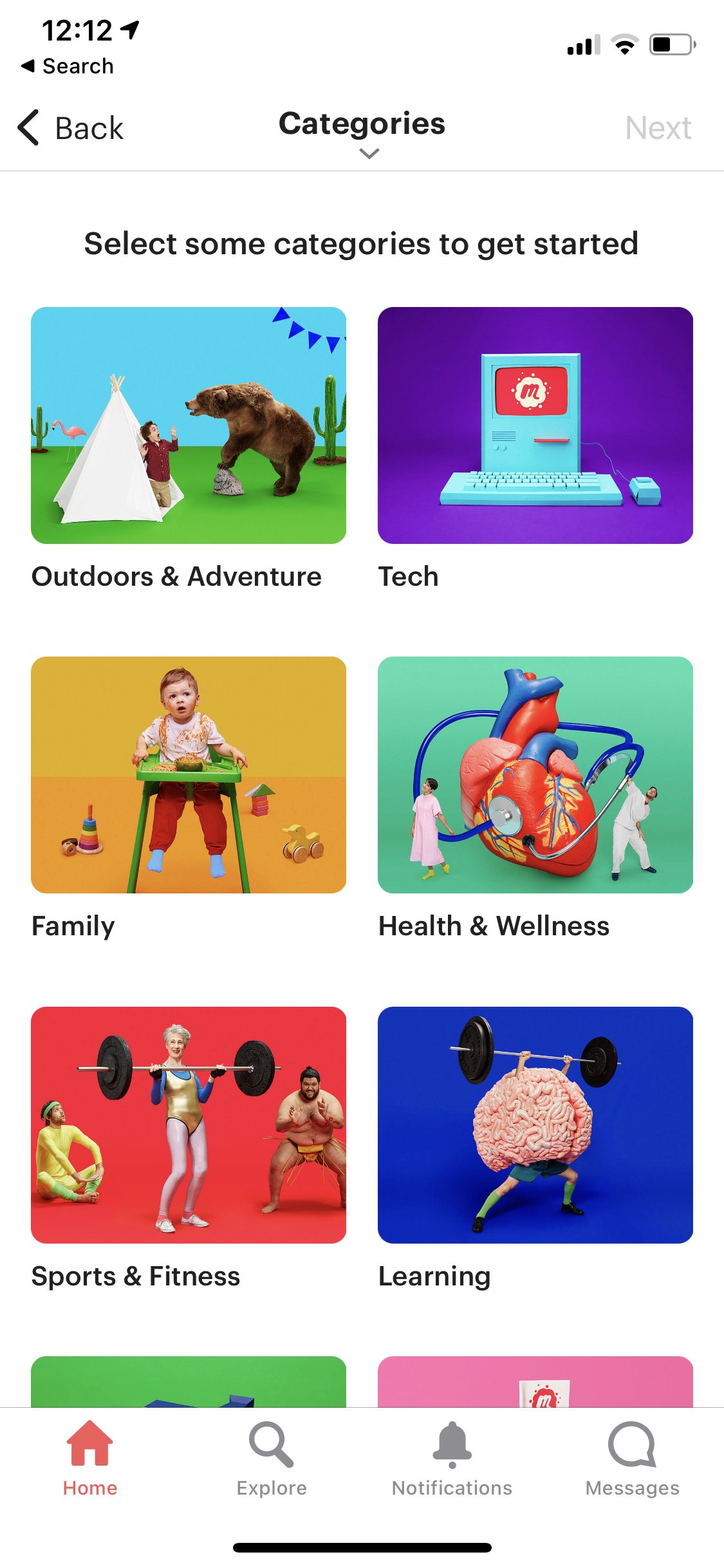
Screenshot of the MeetUp app categories page.
The primary features I took away from these examples were the ways I can use calm colors to still draw attention through negative space and juxtaposition and the use of bright colors to make machine learning exciting.
Personas
Sarah Black (teenage user), Kristal Smith (young adult), and Shawn Johnson (middle age professional), all speak to the different target users of LocalEyez. They represent different relationships to an events app.
Sarah wants to enjoy the friendships she already has through her school and around her classwork, Kristal is looking to expand her friend group post-college and has a more art and bar focused lens, and Shawn has more professional and connection-centered desire out of his meetups.
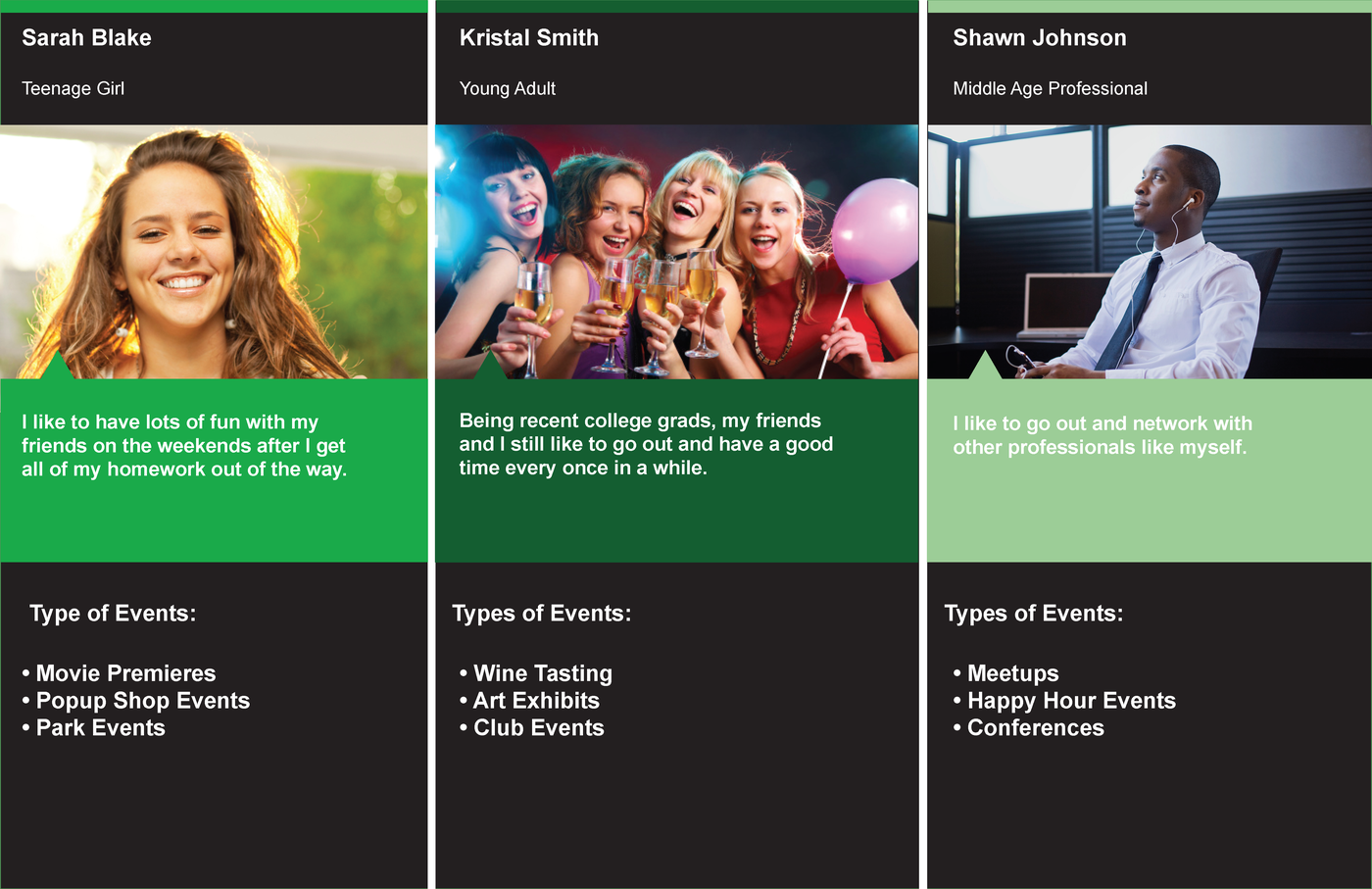
Photo of Personas provided by LocalEyez.
User Stories
Heather Stevens, a Shawn, interested in family friendly and professional events, feels like she’s not getting enough time with her family.
A coworker recommends LocalEyez to Heather when she complains about not having enough opportunities to have fun with her family.
Heather wants to find an event which allows her to spend time with her family while exploring career advancement opportunities, so she enables the family preference in tandem with the networking preference when on-boarding.
Then, when returning to her feed, she sees suggested events tailored to her needs.
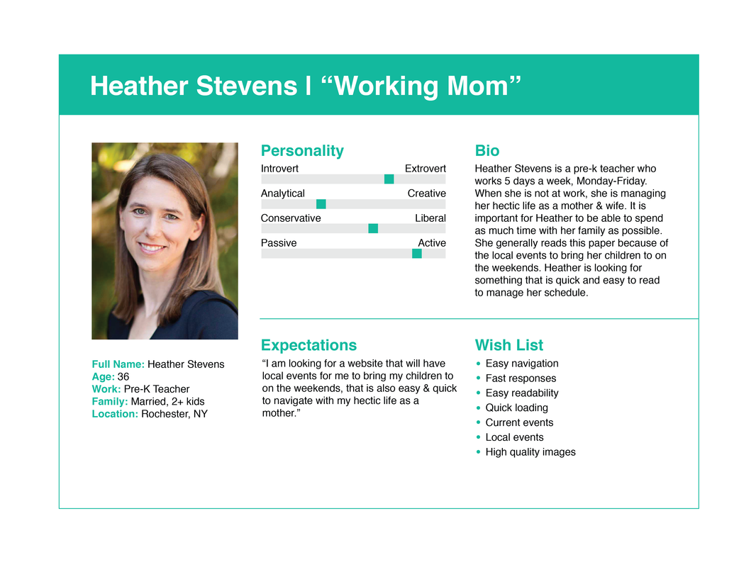
Graphic of Heather Stevens, of the Shawn persona, and her user story.
Nick James, a Kristal, works in tech but spends all his downtime playing sports and watching games.
Nick wants to connect with other sports enthusiasts as a recent transplant to Chicago.
Nick finds LocalEyez through a search of local events apps. After creating a detailed profile about his love of sports to entice fellow sportsmen, including his sports event preference, Nick finds sports events and venues already highlighted in his map of the city before even searching.
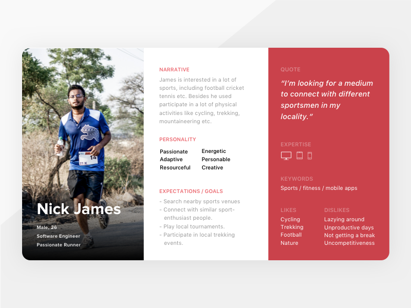
Graphic of Nick James, of the Kristal persona, and his user story.
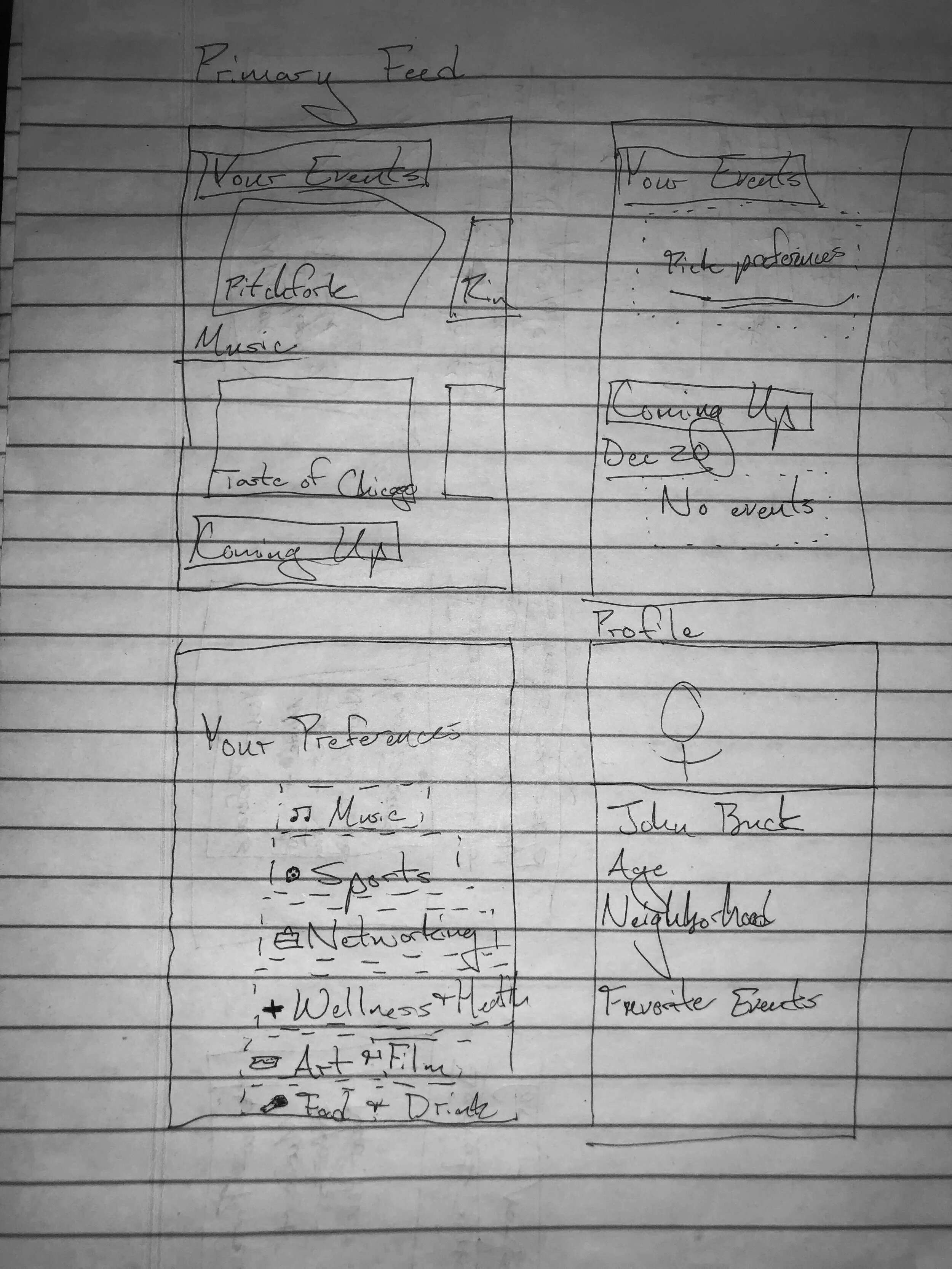
Sketches
Wireframe Sketches
I modeled my layout on the layout of Foursquare but with the customization of MeetUp’s categories. I chose to use take an icon-based, minimalist design for the Preferences page. These were to be colorful in the hi-fi frames. I wanted to integrate one’s event history on LocalEyez and Facebook both on the Profile page to give greater depth and engagement on Profiles.
My sketch of the landing page possibilities for the BAX design. These feature hero images with the possibilities of multiple carousels.
The Story Board I made followed Jerrod, a Shawn-like individual, through his attempt to find sports events on LocalEyez. It showed me how important it would be to use machine learning to display things the user would be interested in on the interactive elements of the Search page.
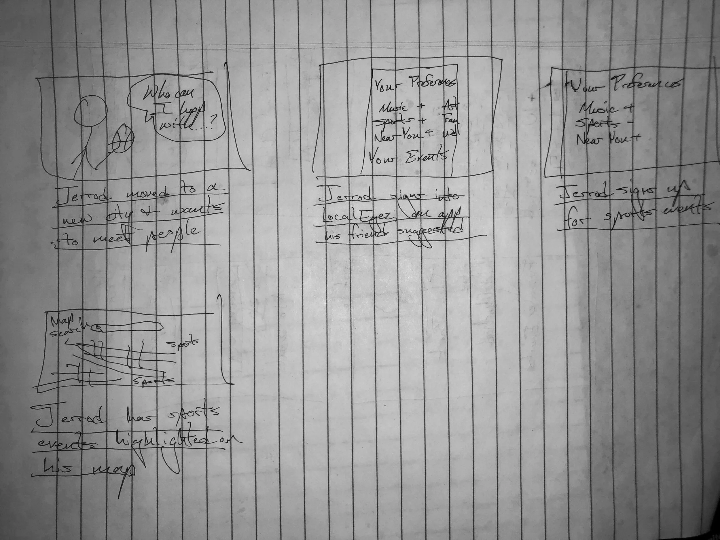
Eight different sketches of possible page layouts. Stick people are representative of images, squiggly lines are text, and lines are page breaks.
Digital Wireframes
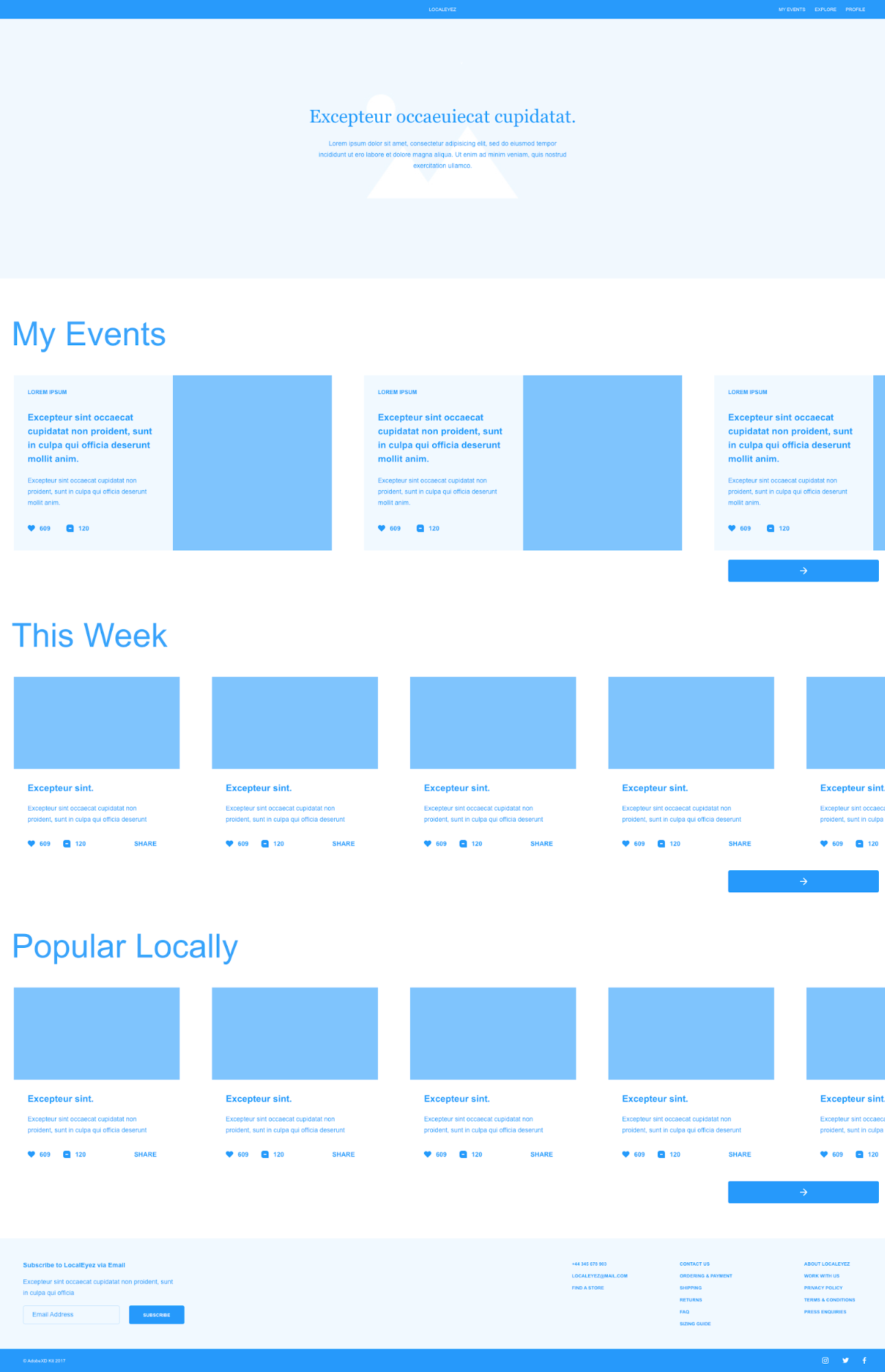
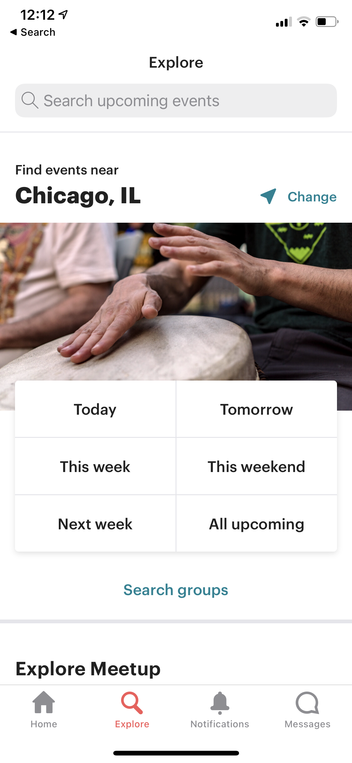
I chose to use the categories idea from MeetUp and an Interests section on the profile pages to feed into the machine learning apparatus. I used shades of blue and white to color the prototype to maintain consistency with LocalEyez’ branding. Top of the page navigation bar seemed most intuitive given its dominance across the user interface. Subheadings and minimal copy buttressing hero image seem both standard and useful given the depth of BAX’s offerings. I decided to abandon the image wheel for unity’s sake, as no other page would have it.
Initial wireframe of the layout for the Feed page.
Screenshot of the wireframe’s Search feature.
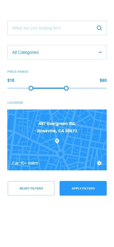
Screenshot of the Search page wireframe.
Screenshot of the Profile page wireframe.
Usability Test on Prototypes
Moving to a first low-fidelity prototype, I added the colors found in the sample logo provided by David. I used the simple, three to four color approach to design found in the competitive analysis to create a modern, relaxed feel across the pages. Monochromatic with neutrals for accents, such as this.
I decided against the sub-header directory because they felt too similar to the original landing pages of BAX’s five domains.
I used visuals for call-to-action items from the pages found on the top navigation bar. Initially, I used black and white to relate to the black and white text found in the logo. The labels for said action items were the same color as “BAX” in the logo to unify the color palette.
I incorporated UserWay’s drop down, should BAX decide to invest in accessibility consulting later. Two-tiered navigation bar with information hierarchy approved by the client.

The color palette of LocalEyez’s style tiles.
Branding
My color choices derived from company’s palette. I developed a style guide based on this image and used that to reinvent the logo for the landing screen. The text in-app is the dark brown you see next to the blue, with all sub-headings are the light brown. Gray and white can be found throughout the background.
This redesign played to the minimalism the client requested while entertaining the user through engaging colors.
LocalEyez’s logo.
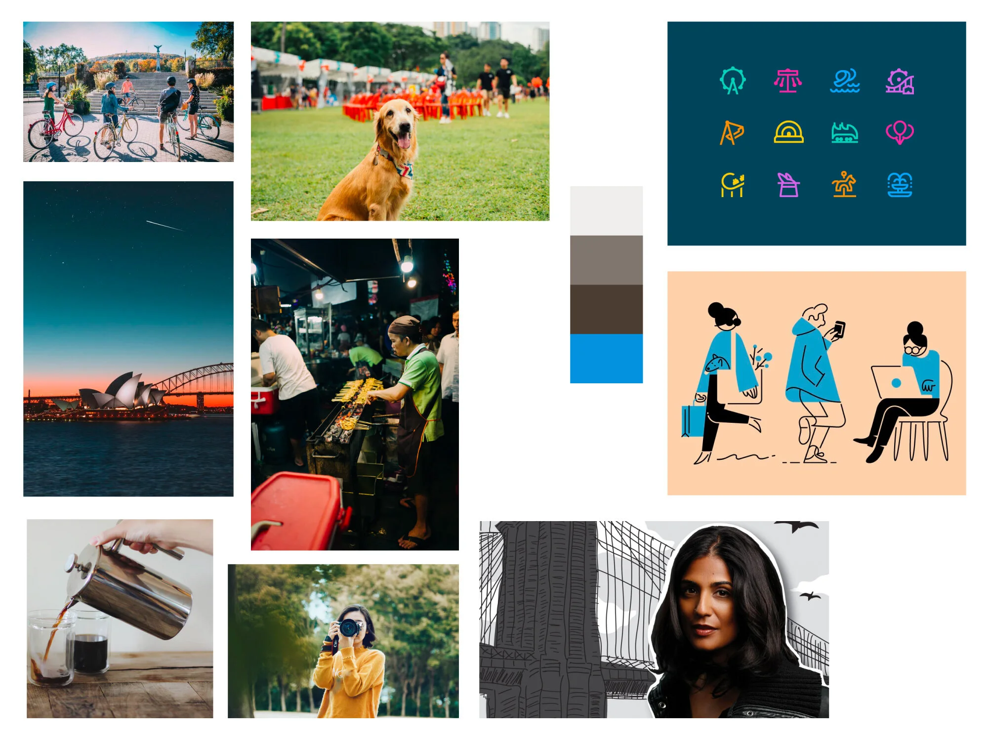
Moodboard provided by LocalEyez.
Usability Tests
Tasks
Users were asked to go through the onboarding process.
Users were asked to find where their saved events are.
Users were asked follow a venue.
Overall Experiences
The blue of the wireframes needed to be darkened over the background. Users found the preference buttons cute and engaging. Users found the copy for events to be to generic so I incorporated local Chicago performer and venue information. Users for the profile to be a little too formal with the box photo so I made it into a frame that fades into the information.
Next Steps for Improving the Website
The primary focus going forward on this project will be expanding the categories possible to incorporate all of the interests users are looking for to provide better machine learning results. The more exponents, the better. Connecting the platform to other social sites that people promote on like Facebook/Instagram and LinkedIn will be crucial.
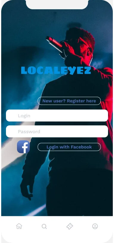
LocalEyez onboarding login page.
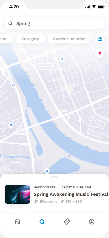
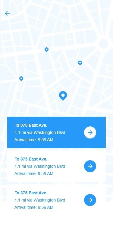
Map image from the Search page.
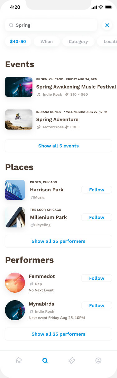
Results from Search page.
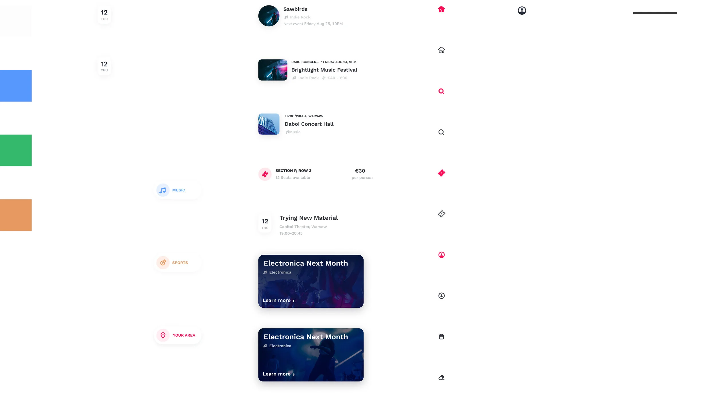
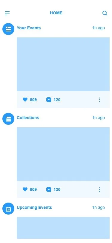
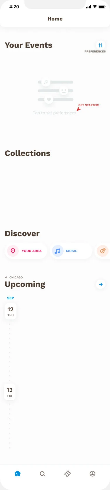
Home feed with loaded preferences.
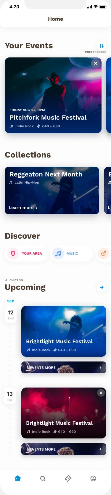
Screenshot of the high-fidelity home feed when preferences have been set.
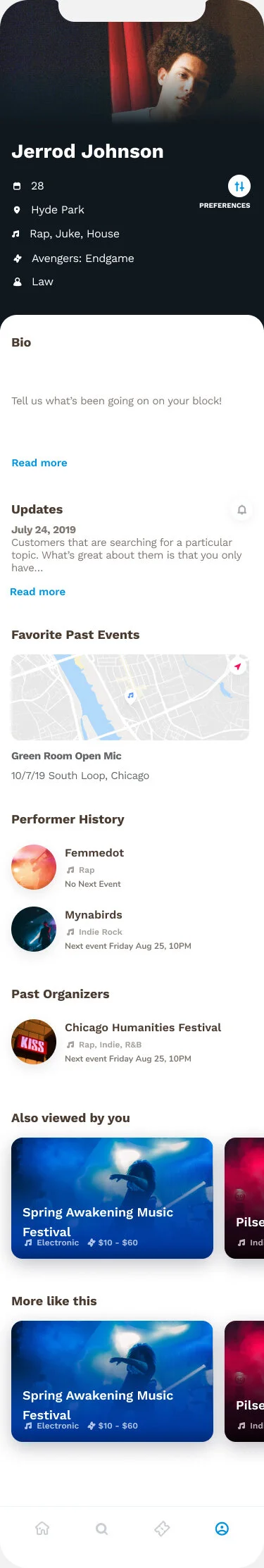
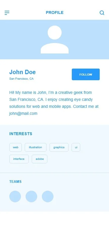
Profile page information after having logged some preferences.
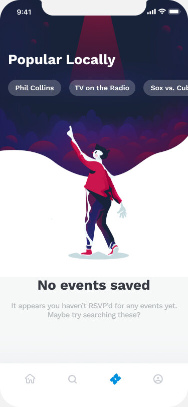
RSVP results on the Saved page.
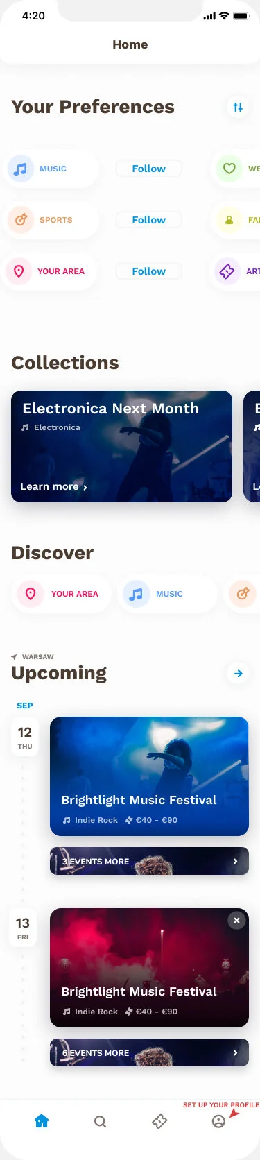
Screenshot of one of the highfidelity home feed when blank.