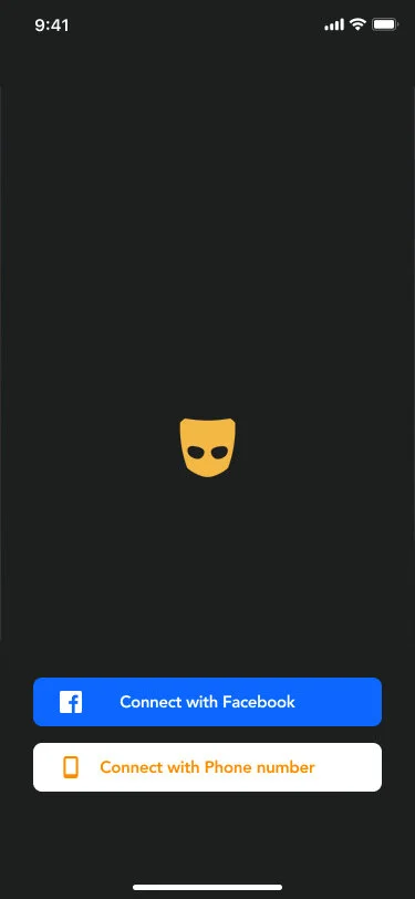
My final design for the Grindr landing page, incorporating a Facebook login.
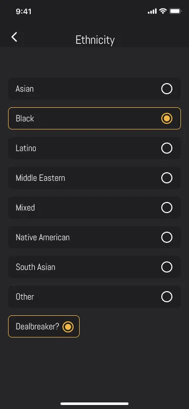
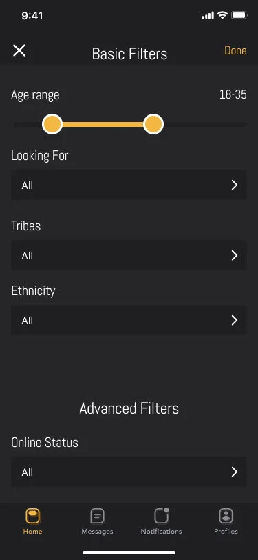
My redesign of the ethnicity filter used for protection.
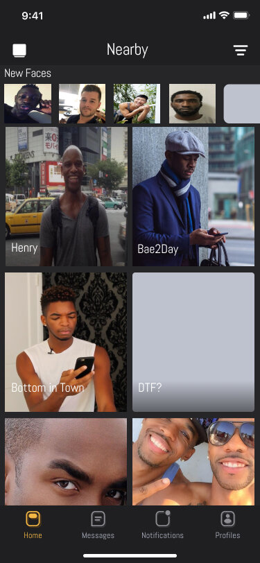
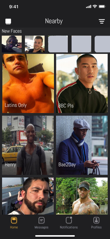
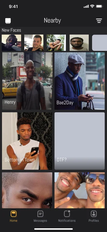
My design for what feeds can look like for Black and brown users with the Ethnicity filter brought from behind the paywall.
New Feature, New Grindr
Grindr is a location-based dating mobile app designed “for gay and bisexual men,” though gender is malleable and their user base is much wider. Its mobile interface is based on a tile grid of profile pictures sorted linearly by their user’s device’s distance from the active user’s device, combined with a basic instant-messaging platform and a robust system of filters.
Problem Statement
In response to the uprisings of May 2020, Grindr announced they would remove the controversial “ethnicity” filter. However, this was met with debate over whether the filters protected or harmed Black and brown users.
Solution
We chose to develop a functioning prototype of a redesigned Grindr that:
allows users the option to utilize filters, while;
suggesting the negative impacts that discriminatory bias has.
The Team
Product Manager
Data Scientist
Product Designer (Me)
My Roles
User Researcher
UX Designer
Visual Designer
Deliverables
Academic Literature Review
Competitive Analysis
User Interviews
Domain Research
User Survey
User Personas
Annotated Sketches
Mid-Fidelity Wireframes & Prototype
Scope & Constraints
Grindr is already an established brand, so we were working within a design ecosystem that already exists. In choosing to improve an experience that already exists, we had to innovate while maintaining consistency with the brand.
Process
I conducted a survey of users of Grindr’s website in order to ascertain two pieces of information: belief’s about Grindr and experiences of racism on Grindr.
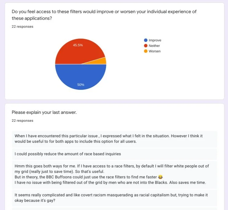
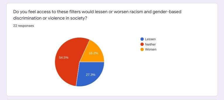
Survey responses from Grindr users around whether identity-based filters improved or worsened their individual experiences.
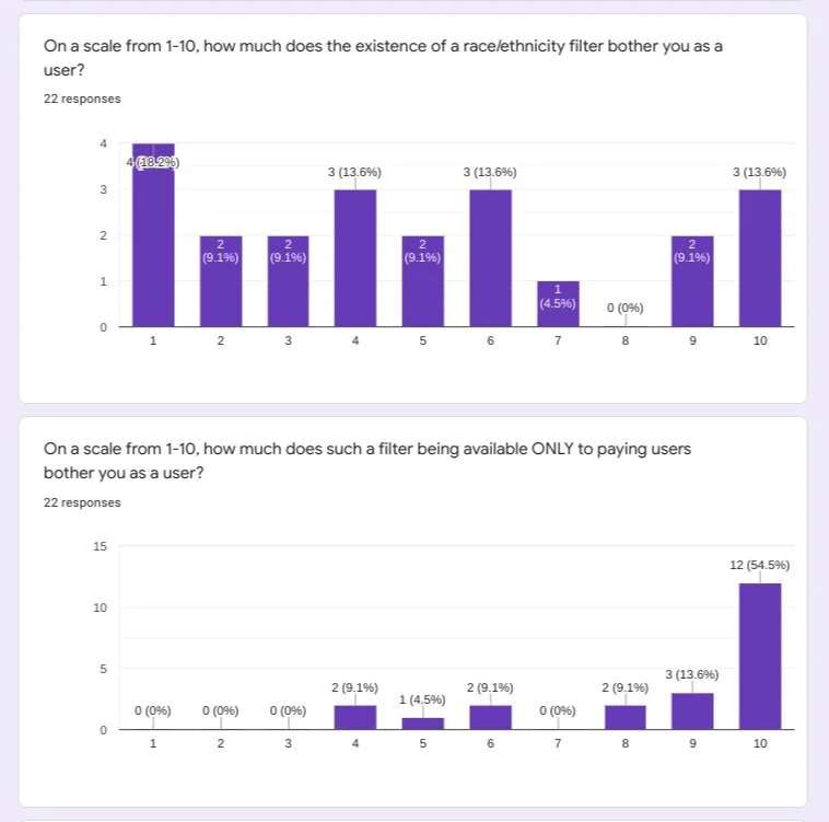
Survey responses from Grindr users of color and those of gender-variant experiences. These questions focus on the users feelings about ethnicity filters both inherently and behind a paywall.
Of the 22 respondents, their ages ranged from 18 to 39 and comprised specifically Black and brown queer and trans users, as well as white users of gender-variant experiences. This was done to combat what felt like a bias towards a white, cis gender user that the topic literature seemed to have.
The majority of these users said that identity based filters either improved or had no impact on their individual experience of the platform, with less than 5% saying they believed it would worsen their experience.
The primary issue users had with identity filters was for with them being behind paywalls. More than half of users stated they believe these filters have no material impact on society at large.
With this in mind, it became clear that these filters had a function that should be investigated. The decision to remove them felt like an act of virtue-signaling without taking into account what users who experience racism actually feel on the matter.
Survey responses from Grindr users of color and of gender-variant experiences. This questions asks about the impact users feel filters have on society.
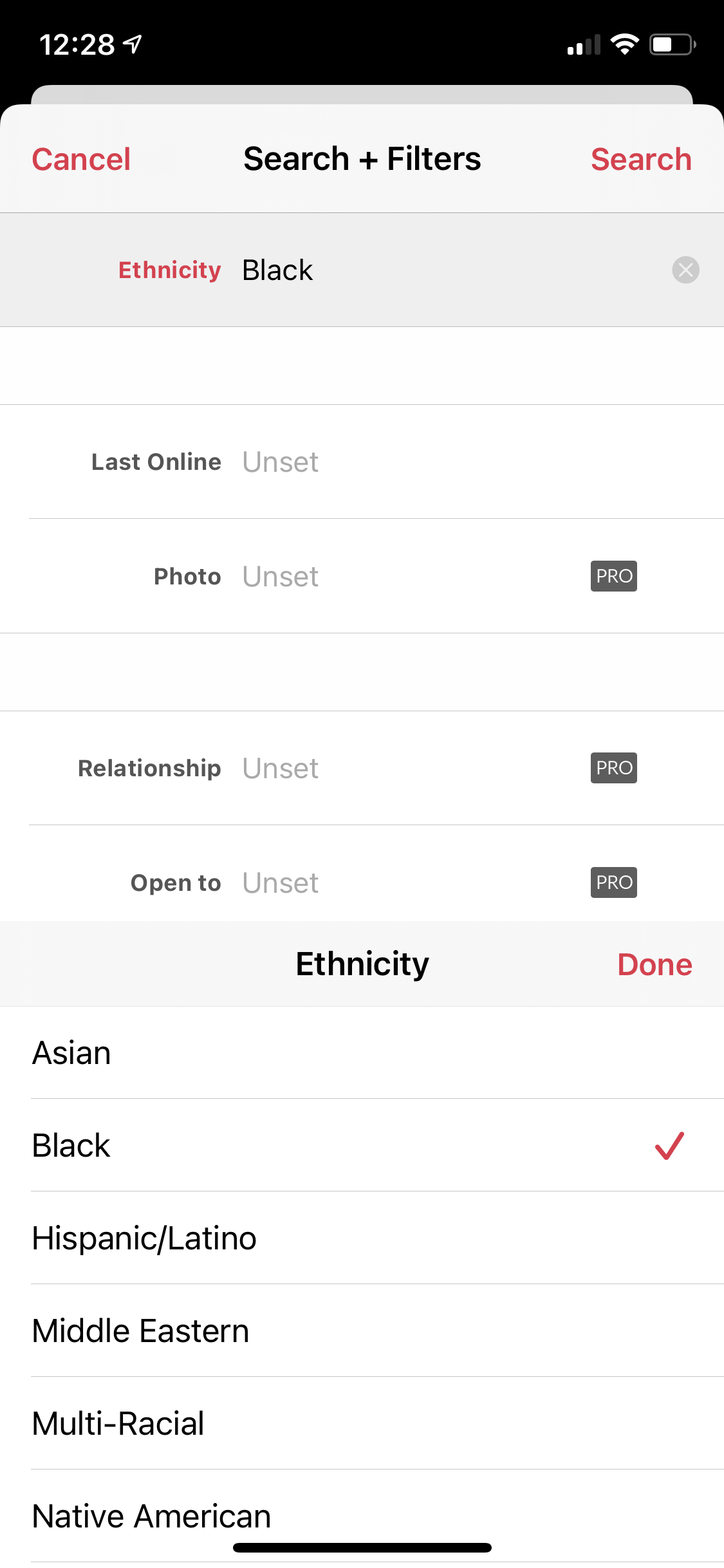
Screenshot of the Jack’d filters screen.
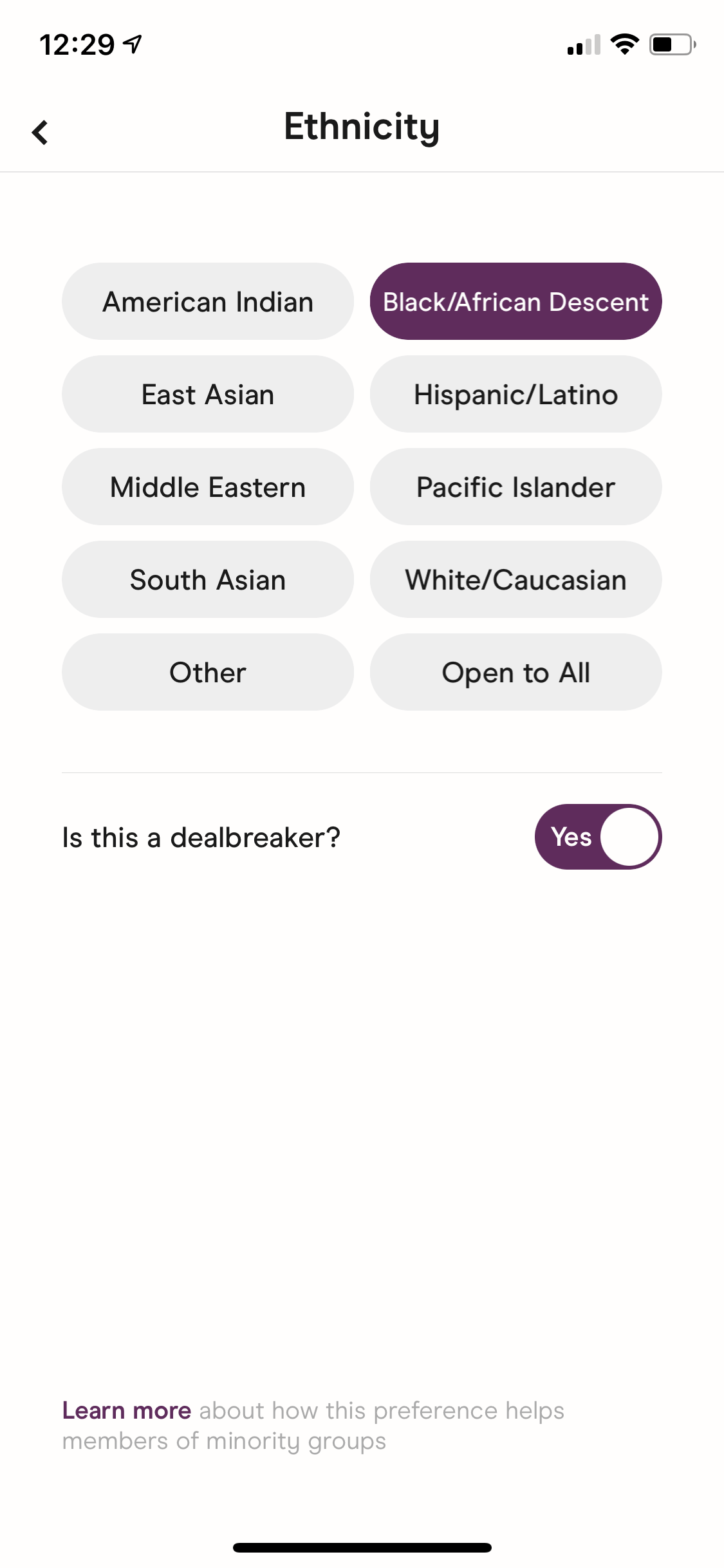
Screenshot of the Hinge ethnicity filters screen.
Competitive Analysis
For context, I compared the apps Jack’d and Hinge. Intimate platforms, a term borrowed from the Cornell study this case study is responding to, refers to all kinds of dating and hook-up apps. Within that category exists two separate smaller categories: hook-up apps and more long-term dating apps. I wanted to compare one of each with Grindr, given the data which suggests over half of gay couples meet online.
Jack’d is widely considered the Black and brown version of Grindr. It also allows all users to use ethnicity filters without a subscription. Jack’d falls into the hook-up category of intimate platforms, but their subscription features are centered around filters and tools that investigate the types of relationships users are looking for, suggesting an investment in the depth of the relations users are seeking.
Hinge falls into the more long-term category, with its slogan being “the app that’s meant to be deleted.” Hinge also allows users to set ethnic preferences but adds a question, “Is this a dealbreaker?,” prompting the user to interrogate their relationship to the filter they are implementing. I found this to be intriguing as it creates a dialogue between the user and the platform via its settings and suggestions. Without the dealbreaker button activated, users will be exposed to users of all races once they have exhausted their preferred users within a given geographic area.
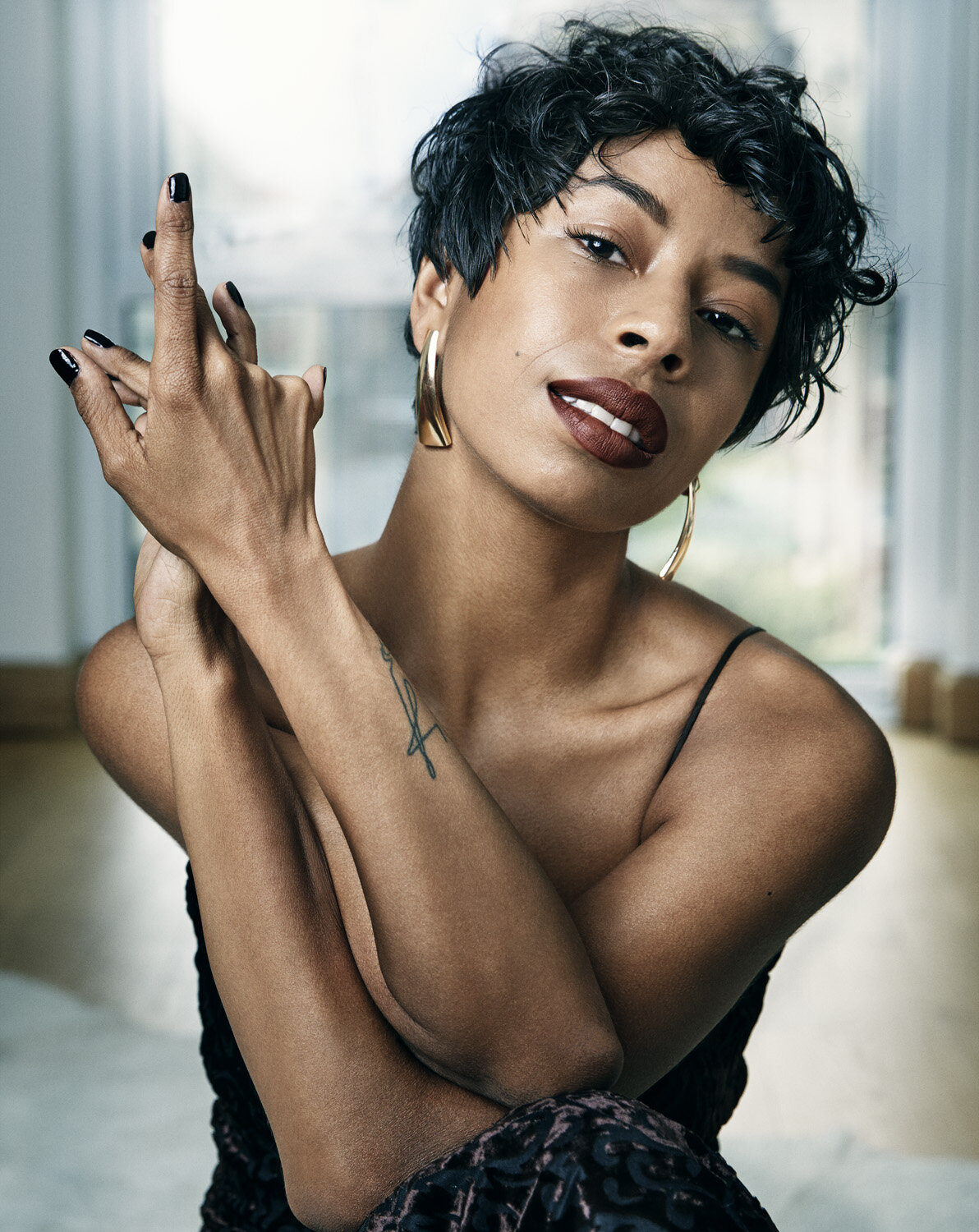
Photo of Kia LaBeija for the VIllage Voice by Sophy Holland.
Personas
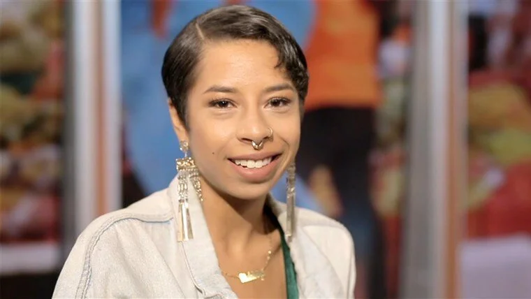
Kia (25, Performance Artist) has been using Grindr since before she began transitioning, stayed on for the community. She finds Jack’d to be the least racist of these types of hookup platforms but prefers Grindr’s interface. She uses filters on Jack’d because she sees fewer passively racist profiles that way.
Photo of Richy Jackson on Abby’s Ultimate Dance Competition.
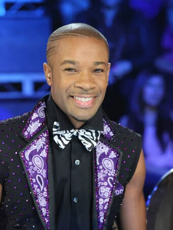
Richy (36, Dancer), primarily uses site to hookup and chat with other gay men. He iews Grindr as primarily a hookup platform and spends little time on it besides trying to hookup, needs it simple and straightforward.
Richy is bothered by the idea that there are users opting-out of seeing him because of his race since he has dated men of all races before. He has experienced fetishization but thinks that is unavoidable on intimate platforms.
User Stories
Kia wants to avoid the racists around her because she is also worried about transphobia, but finds people who are attracted to her more easily on a queer-oriented platform like Grindr.
She uses Grindr to get to know guys and to also publish writing about her experiences in the dating world.
Photo of Kia LaBeija for NBC News.
Richy has a busy schedule and is looking to find quick, easy hookups with whomever is nearby and meets his (non-ethnic) standards. His busy schedule also means he won’t want to regularly update his filters and will actively ignore the racism he encounters.
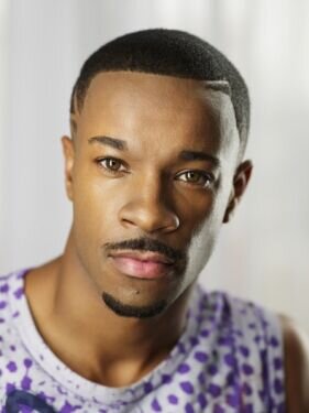
Headshot of Richy Jackson.
Sketches
Wireframe Sketches
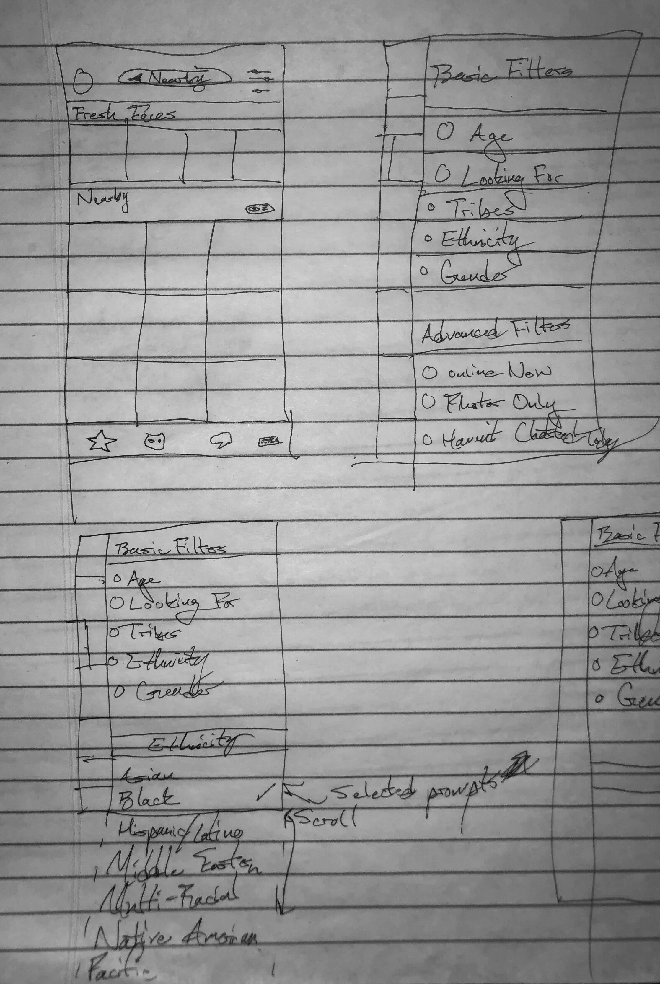
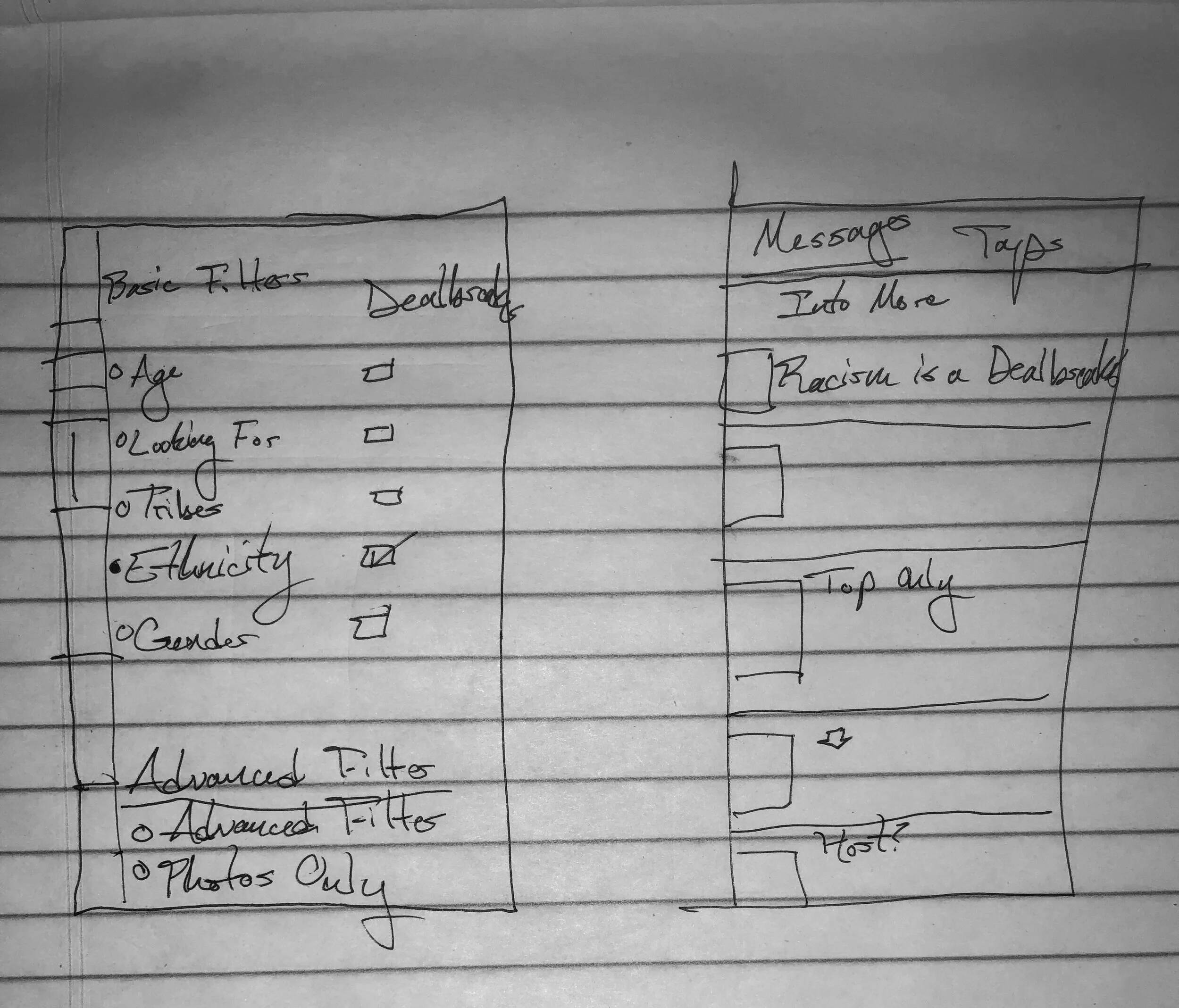
Modeled my sketches on the original Grindr filter layout and moved Ethnicity and Gender to the basic section, bringing it from behind the paywall
Interviewee Galen’s response saying “I use these filters to see more people like me” left me with the impression that the filter itself is worth its protective bias.
Initially I went with a slider, like Grindr’s existing interface uses, to maintain uniformity.
My sketch of the main feed and updated filters pages.
I included messaging for users that selected dealbreaker to have them think twice about their choice to self-segregate.
I returned identity filters to the Basic Filters section to help users better curate their own experience of Grindr.
Iterations of potential interface options for the selection icons on the filters page, left. Example of machine learning being used to target users who display extremely selective behavior based on ethnicity, right.
Digital Wireframes
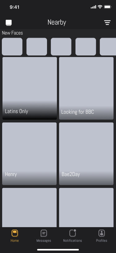
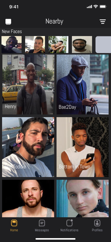
I used racist names for profiles to signify the passive racism both Jeremy and Galen reported in their interviews. I maintained the box-based structure of Grindr’s main feed, while opting for two squares and not three to highlight visual cues. I only used one color in the wireframe, Grindr-yellow, to signify where the user is located. I used the Abel font to best approximate the clinical-looking, minimalist interface of Grindr . I incorporated Grindr’s bubble icons within the filter setting to emphasize the impact of one’s choice after the truncated main filter page. I implemented the Dealbreaker feature here, from Hinge.
Initial wireframe of the layout for my Grindr redesign.
Screenshot of the initial low-fidelity prototype’s machine learning messaging tool.
Screenshot of the initial low-fidelity filters page.
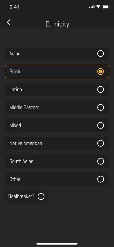
Screenshot of the interface elements used for the filters page.
Branding
My color choices derived from the style guide that is Grindr’s current branding. I iterated upon certain elements, like the buttons for various pages, so as to differentiate my design from the work of Grindr’s team.
Grindr’s login page on my prototype.
Screenshot of the filters page Dealbreaker feature.
Preference Tests
I presented multiple prototypes of multiple colors text placements to get a sense for preference. Users reported: a preference for the white background as it highlighted the colors on the page, issues with the text beneath the images as she felt the attention was too widespread, and discontinuity between placements of elements between pages. Overall, users loved this iteration’s attention to visual unity.
Usability Tests
Tasks
Users were asked to log-in and access their main feed.
Users were asked to access their ethnicity filters.
Users were asked to turn off the Dealbreaker feature.
Frame of the home feed without any filters applied, displays of passive racism from other users.
Frame of the home feed with filters applied to see only users of the persona’s same race.
Overall Experiences
Presented a single path to illustrate the impact of intraracial self-segregation. Included blank photos as those are common on the apps. Jeremy appreciated the difference, but felt like the difference was a bit stark and left out the people obviously missing. Users reported an appreciation for not having to deal with the racist profiles. Galen, in favor of the filters, still felt the language of the dealbreaker may be too blunt. “You get more flies with honey than vinegar,” they said.
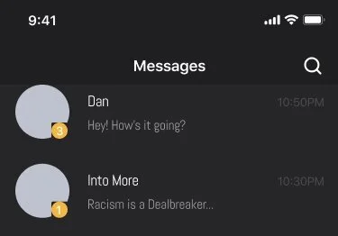
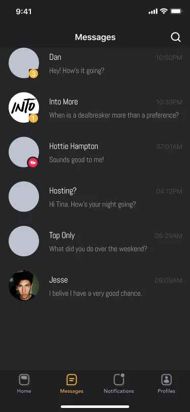
Added branding from Grindr’s Into More to show what the experience of the app responding to the use of ethnic dealbreaker features might look like. Galen said they “appreciate the effort and intention, but did not believe this messaging would get people to actually read.” They also felt that this would need to be a gradual process so as to not feel targeted.
I developed a second flow that shows what a feed would look like without the dealbreaker feature used. This removes all people who do not identify as Black up until the closest people do not meet the filter’s requirements, to provide the opportunity for an expansion of one’s experience. This also allows users to then make something a Dealbreaker if this proves to still yield racist results.
I rephrased the messaging to be less of a condemnation and more of an invitation. Users are more likely to engage with a question than an answer.
Frame showing the use of Into, Grindr’s publication, to send messages to users whose product usage reflects harmful bias in ethnic filters.
Frame of the Ethnicity filters page when the Dealbreaker selection is not chosen.
Next Steps for Improving the Website
Grindr needs to implement similar approaches to gendered experiences of the app. Using machine learning, gathering information about passive and active racism on the platform will be key if moderation proves to be too expensive or costly in other ways. Overall, it is critical for Grindr to center the experiences of Black and brown users of the platform before those who are considered the problem.
Frame of the home feed when an ethnicity filter is applied but the Dealbreaker feature is not applied.


